Design a Professional Wildlife TV Show Poster
Resources Used In This Tutorial
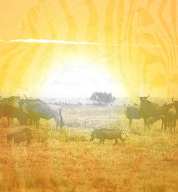
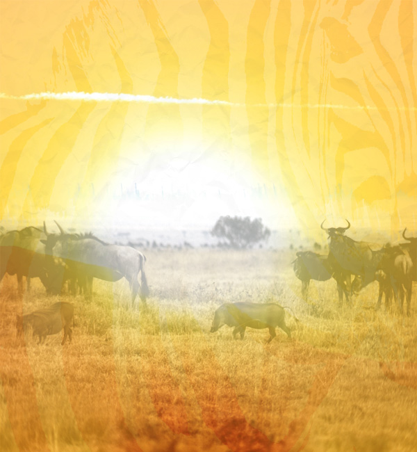
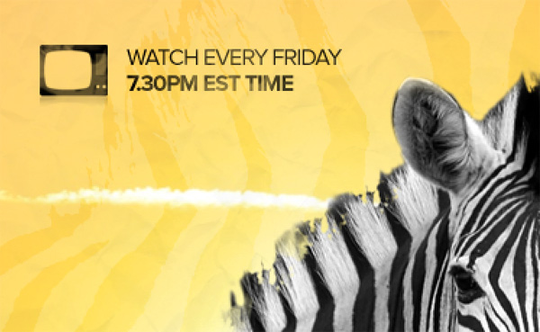
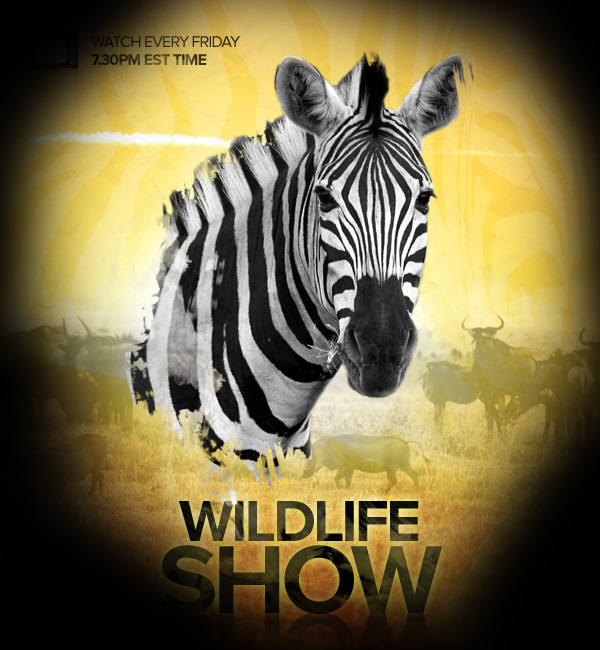
Final Image
Here is a preview of the image that we are going to be creating:

Step 1
Start by creating a new document (600X650px).
Paste in your sunset photo from the resources for this tutorial. Resize and position the photo until you have something like the image below:

Step 2
The bottom of our canvas is looking a bit too red. To fix this create a new layer called yellow bottom.
Drag up a linear gradient ranging from fbac22 to transparent from the bottom of your canvas. This should create a more even yellow tone to your background:

Step 3
Now paste in your crumpled paper texture from the resources for this tutorial.

Now apply a levels adjustment layer. Be sure to apply a clipping mask to your adjustment layer, so that it only effects your underlying crumpled paper texture layer.
Levels Adjustment Layer Settings:
71 / 1.00 / 216
This should really up the contrast of your texture layer, giving it more definition, which will be important for the next part of this step

Now return to your crumpled paper texture layer and reduce its opacity to 10%. Also change its blend mode to multiply.

Step 4
Now open up your zebra photo as a new document:
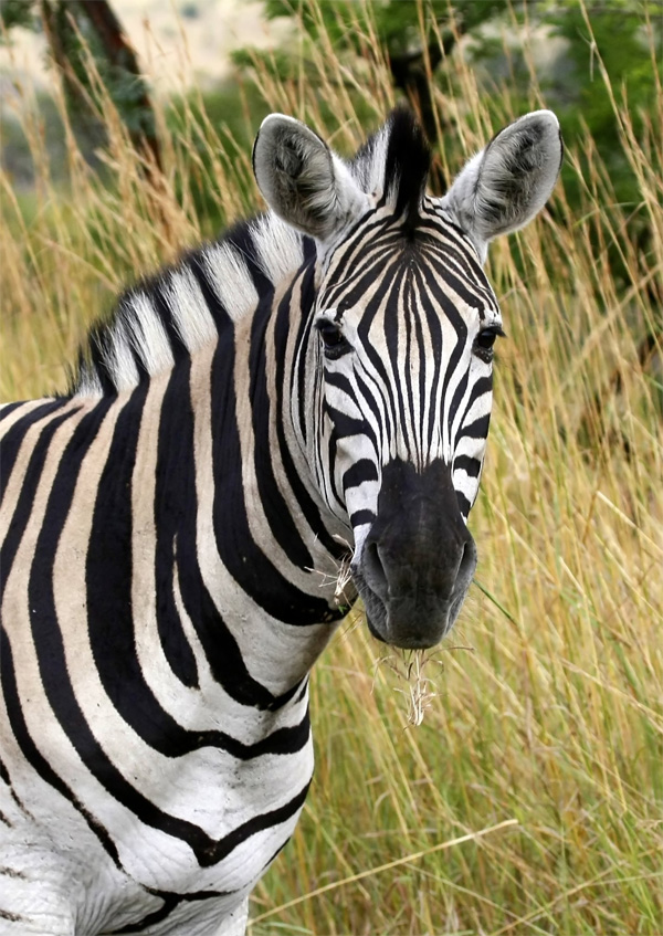
Go to image>desaturate to grayscale it, and then massively up the contrast until you have something like the image below. The aim is to make all of your zebras black stripes 100% black.

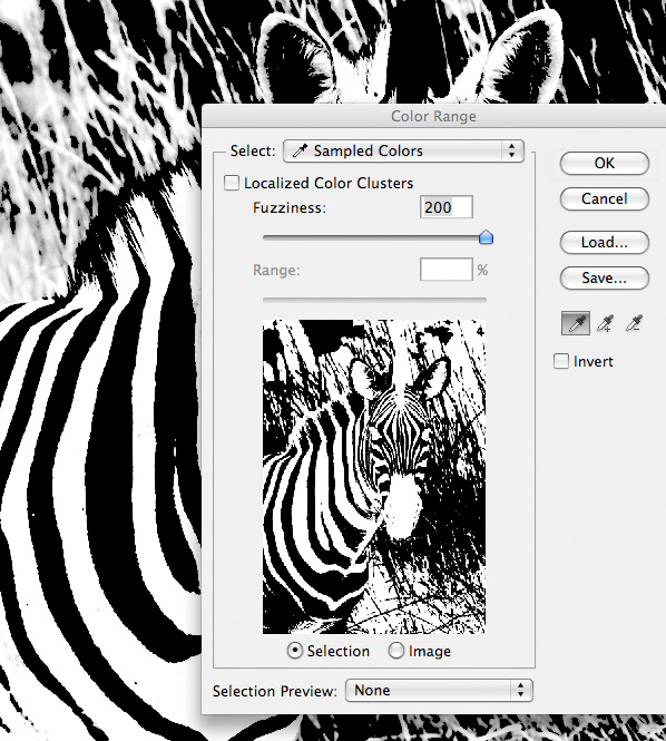
Now go to layer>flatten image. Then go to select>color range.
Use your eye dropper tool to click on one of the zebras black stripes. Then up the fuzziness to 200. In the preview window you should see all of the black areas that will be selected by your color range settings:
Step 5
Copy your selection from the last step. Then reduce to your original document and paste in your black striped selection.
Now change this layers blend mode to overlay and reduce its opacity to 25%
Step 6
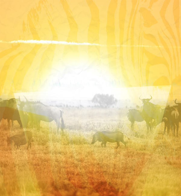
Now paste in the photo of wild beasts from the resources for this tutorial.

Now reduce this layers opacity to 35%. Apply a layer mask and mask off the top of your wild beast photo using a black paintbrush (using of the brushes from the watercolor set in the resources for this tutorial). Try to blend the wild beasts photo smoothly into your main background.

Now apply a levels and hue/saturation adjustment layer. With each adjustment layer be sure to apply a clipping mask, so that they only effect your underlying layer.
Levels Adjustment Layer Settings:
36 / 0.67 / 201
Hue/Saturation Layer Settings:
Hue: 0
Saturation: -50
Lightness: 0

Step 7
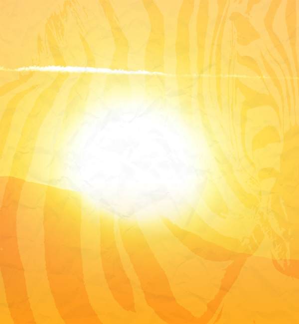
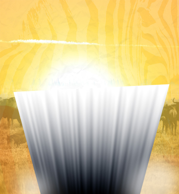
Now create a layer called heatwaves. Drag up a black to white linear gradient from the bottom of your canvas:
Now go to filter>distort>waves. Apply the settings below and hit ok:
Wave Filter Settings:
Number of Generators: 5
Type: Sine
Wavelength: (min: 5, max: 30)
Amplitude: (min: 5, max: 35)
Scale: (Horiz: 100%, Vert: 100%)

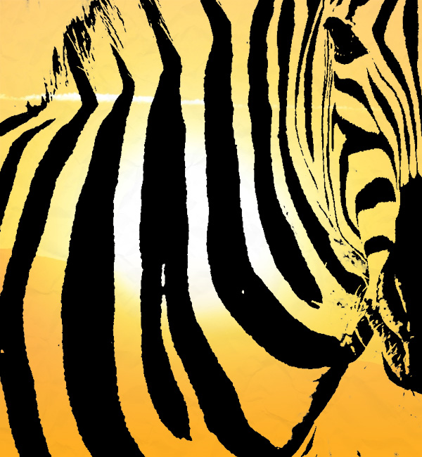
Now go to layer>rasterize>layer. Then go to edit>transform>distort, and distort your heatwave layer into a shape like the image below:
Now reduce this layers opacity to 50% and change its blend mode to overlay:
Now apply a layer mask, and use a soft black paintbrush to mask off the edges of your heatwave shape until you have a subtle result like the one below:
Step 8
Now paste in your zebra photo:

Now apply a layer mask and mask until you have something like the image below.
This part is quite time consuming, but its worth spending the extra effort. Simply follow the process laid out below:
1. Start by using a regular black paintbrush to mask off the zebras background (zoom in where necessary and use a smaller paintbrush to focus on smaller details).
2. Then use a black paintbrush using one of the brushes from your watercolor brush set, in order to apply a grungy, artistic edge to the bottom edge of your zebra. Play around with which watercolor brushes work best and if you make a mistake simply repair your layer mask!

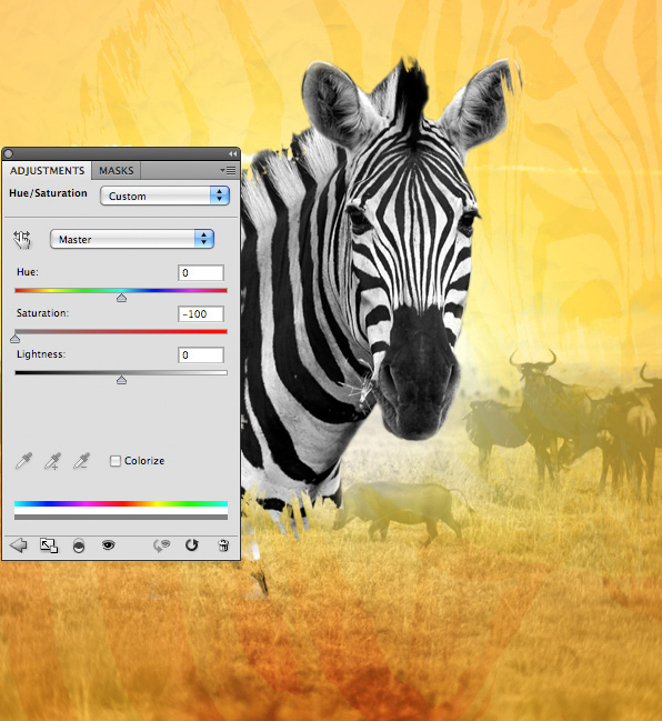
Now we want to grayscale our zebra. To do this simply apply a hue/saturation adjustment layer (complete with clipping mask).
Hue/Saturation Adjustment Layer Settings:
Hue: 0
Saturation: -100
Lightness: 0
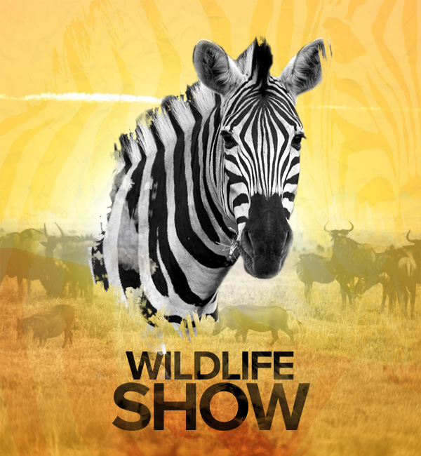
Step 9
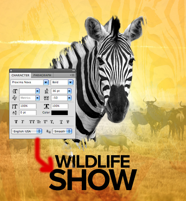
Now apply some text beneath your zebra. I used the font settings laid out below:
Headline Text Settings:
Font Face: Proxima Nova
Size: 100pt
Styling: Bold
Kerning: -50
Color: 000000
Now apply a layer mask to your text layer. Use one of your watercolor brushes at around 20% opacity (black) to brush over your text, masking it off subtly, and giving it a grungy appearance:
Now apply an outer glow blending option to your text layer.
Outer Glow Blending Option Settings:
Blend Mode: Overlay
Opacity: 70%
Color: ffffff
Spread: 0%
Size: 10px

Step 10
Now duplicate your text layer, moving your duplicate BENEATH the original.
Clear all layer styles, and then reduce this layers opacity to 70%. Then go to edit>transform>flip vertical.
Move your flipped text just beneath your original text, giving the impression of a shadow/reflection. If required use a soft black paintbrush to help fade this shadow into your main background:

Step 11
Now, in the top left of your composition, paste in the tv icon from the resources to this tutorial. Also write out some text to the right of this icon.
Text Settings:
Font Face: Proxima Nova
Size: 16pt
Styling Bold
Kerning: -50
Color: 000000

Now repeat the masking technique used on your larger headline text (apply a layer mask and use a low opacity watercolor brush to achieve a grungy appearance):
Step 12
Now create a new layer called vignette. We want to draw the viewers attention towards the center of the canvas.
To do this, select a large, soft black paintbrush (100% opacity). Paint around the edges/corners of your canvas.
Then to make the effect more subtle, reduce this layers opacity to 10%.

Step 13
Finally, create a new layer called dodge/burn. We are going to dodge/burn our image non-destructively.
To do this, go to edit>fill and fill your canvas with 50% gray. Then change this layers blend mode to overlay. This will hide your 50% gray fill, but will let you non-destructively paint black/white over your canvas in order to dodge/burn it.
Use a soft, black paintbrush at around 10% opacity to burn your image, and then switch to a white brush to dodge it. This step adds a lot of impact to your image, as you can see below:
And Were Done!
You can view the final outcome below. I hope that you enjoyed this tutorial and would love to hear your feedback on the techniques and outcome.
Download Source File for this Tutorial

Get more of our great design content direct to your inbox
Join our newsletter and receive our best weekly content by email. Also get access to hundreds of free design resources via your Designer Toolkit area.
About the Author:
Tom is the founder of PSDFAN. He loves writing tutorials, learning more about design and interacting with the community. On a more interesting note he can also play guitar hero drunk with his teeth.
Related Posts
Travelling is my life
ConversionConversion EmoticonEmoticon