
By Lewis Wadsworth
Its somewhat peculiar to begin a tutorial for SketchUp with a prolonged discussion of a certain concept in image editing called masking. But without this clarification you might not quite understand why I set up my SketchUp models in a such a very specific manner.
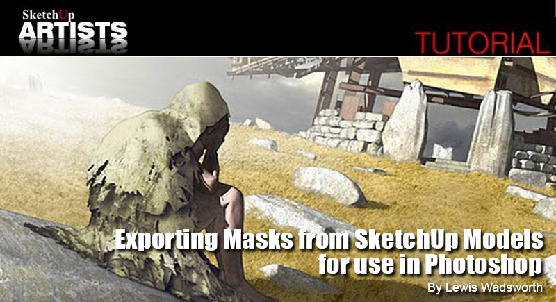
So what are we talking about? Masking was originally a traditional analog art technique. Most adults will discover that they are familiar with it, even if they have never used it for anything more elaborate than house-painting: if you cover some part of a wall with masking tape and then paint across the surface, on removal of the tape you will find that the area it had covered was (hopefully) protected from the paint subsequently applied to that wall. In the fine arts, including painting, photography, printing, and even ceramics, this basic technique has been refined and elaborated in a thousand specific ways, depending upon the medium and the exact degree of protection of the underlying surface that the artist needs.
In the realm of raster image editors (in other words, with computer programs like Adobe Photoshop, Paint.NET, or GIMP and not for the most part with vector graphics editors such as Adobe Illustrator, Inkscape, Xara, or CorelDRAW), you create and use a mask for most practical purposes any time you select part of a digital image (by using in Photoshop, for instance, the Marquee Tool (M), the Magic Wand Tool (W), the Lasso Tool (L), or the Color Range dialog from the Select menu). Those little crawling ants that mark the edges of your selection also indicate the edges of the mask; the area of the image outside of your selection is protected, or masked, so that if you now (for instance) apply the Gaussian Blur filter (Filter>Blur>Gaussian Blur) those outside areas will not be subject to blurring. Notice, too, that while a selection is active in Photoshop, you cant use tools like the Brush (B) or Stamp Tool (S) to color or change any part of the image outside of the selection. Once again: those areas are masked, and as long as they are not part of the selection you cant mess with them. One more time: Whenever you select part of the image, the unselected parts are masked.
In Photoshop (and one way or another, in most other image editors) a selection, along with its attendant mask, can be thought of as an image itself (sometimes referred to as an alpha channel), with the same dimensions (height and width, in pixels) as the image to which it has been applied. The idea is that the area of the alpha channel image representing the actual area selected in the original image is black; the area outside of the selection (the masked area) is white. If for some reason, areas of the original image are only partially selected, in the alpha channel these will be represented by shades of gray, with the lighter gray pixels in the alpha channel indicating less-selected areas in the original image and darker grays indicating more-selected areas.
You can test this idea for yourself by opening up an image in Photoshop and selecting some part of it, say with the Marquee Tool (M). If you now open up Photoshops Channel window (Window>Channels), you will notice at the very bottom of the window a set of icons. If you hold your mouse cursor over the second one on the left (the one that looks like a white circle inside a gray square) you will see a tool-tip prompt reading, Save selection as channel. Left-click the icon, and notice that a channel named Alpha with some number affixed is now added below whatever standard color channels are listed in that window.
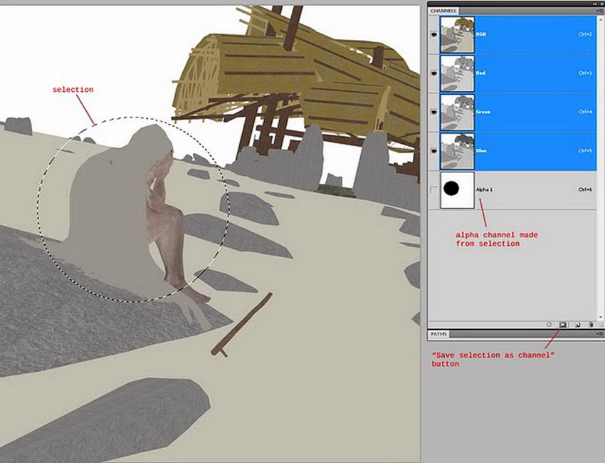
Save Selection as Channel
If you single-left-click the icon for the new channel (or its name, which you can change to something more descriptive if you so choose) Photoshop will display the gray-scale channel in its main image window. Left-click the far-left icon at the bottom of the Channel window (tool-tip: Load channel as selection) to turn the channel back into an active selection. Then left-click the channel at the very top of the Channel window (it will be named something like RGB, CMYK or Gray depending upon the color nature of your original image) to see the original image in the main Photoshop window, with the newly-loaded selection ready for some Filter or Tool.
You could also save a selection as a Channel by using the Selection menu (Select> Save selection) dialog in Photoshop and you could load or recreate a selection from a Channel using the Selection menu (Select>Load Selection) dialog. Interestingly enough, if you save a selection to a Channel using the Save Selection dialog in Photoshop, in the saved Channel the selected areas will be represented as white and the non-selected areas as black. It may be necessary, if you are recalling a selection from a Channel, to use the Selection menu (Select>Inverse) function to switch the selected areas to masked areas or vice versa.
The key points to remember here: a selection implies the existence of a mask, and a mask can be saved and reloaded in a digital image (in some image file formats, most notably the .psd and .psb formats used by Photoshop natively) as an alpha channel. Alpha channels can also indicate other characteristics, like the part of an image that is transparent, but even with this sort of channel you could think of it as mask, specifically a transparency mask. Another important type of mask in Photoshop (and in some other image editors, such as GIMP) is the layer mask. A layer mask is a a gray-scale image associated with a particular layer in Photoshop: where the layer mask is black, the layer is hidden, and where it is white the layer is visible. You can paint or otherwise modify a layer mask, and changing the distribution of white and black in the layer mask will change how much of the associated layer shows up in your image.
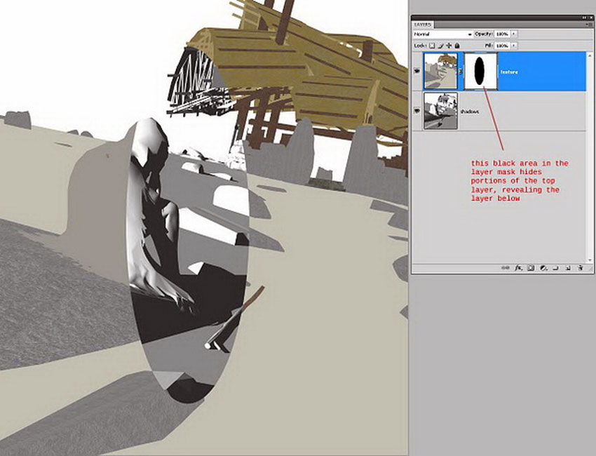
Layer Mask Example
So, now that you know what masking is, as far as a digital image is concerned, you are probably wondering what this has to do with SketchUp.
SketchUp 2D exports are of course digital images, and as we all know in their fresh-out-of-model state they often leave something to be desired, in terms of general aesthetics. Often enough, I use the 2D output from a SketchUp model as simply the basis or skeleton for an elaborately worked-up, painterly illustrationthe fixes (for the imperfections) and the over-the-top artistic stuff are all added with an image editor, usually with one or another edition of Photoshop (currently the long-in-the-tooth Photoshop CS4 Extended, because that is what I own, although I have applied the techniques discussed in this article while using GIMP and Paint.NET, less capable but free alternatives to the grand dame of the Adobe family). Actually, I tend to head towards Photoshop even if I use a rendering plug-in for SketchUp like Podium or Twilight to make a more photorealistic image of my modeltheres no rendering, in my opinion, that cant do with a bit of post-production pixel-scrubbing.
One of the most tedious problems with using Photoshop or a similar raster image editor is controlling the area affected by a tool or a filter, or making sure some part of a layer has just the right degree of transparency to reveal the desired portion of the layer below. Perhaps, in a given bit of 2D export from SketchUp, we have an entourage figure over to the side, and his cloak needs to be tinted a bit more greenor theres a stone in the foreground that needs a realistically random pattern of moss which we can suggest with a creatively-configured brush and the Clone tool. Of course, one way or another we need to keep the parts of the image that dont need those improvements from receiving them. We need masks, in other words.
As noted above in the masking discussion, there exist in Photoshop (and similar applications) an array of Selection tools that allow you to create as precise or as loose a selection (and therefore a mask) as you care. But these tools all have their limitations as far as precision is concerned; they make mistakes that must be corrected, when you set them to automatic in some way; and they always take up precious time. There is almost a Murphys Law effect here: the more urgent your deadline and the less time you have, the more you will need to zoom in to get that selection just rightthe longer it will to make sure you have every pixel masked that must be masked and not a single one more.
Obviously, it would be desirable to have as many of your masks as possible output from SketchUp directly, before you even begin post-processing your images.
My entire modeling technique in SketchUp (and with other modeling applications, such as McNeel Rhino 3D, which permit a similar process) is predicated on generating masks, directly from the 3D model, that allow me to exactly limit the effects of tools and filters when I am ready to go all artistic on the 2D exports or renderings.
Lets formally introduce my example model here: in 2007 I received a small bit of distinction for this particular architectural design, and much was made of the painterly quality of the renderings that accompanied the original article in AIArchitect.
To illustrate this article for SketchUpArtists, Ive added one element (a foreground figure, the Despairing Wanderer) to my Pavilion For Oblivion model. And for purposes of this exercise Ive saved in a carefully-labeled Scene (CAMERA VF east) a camera view that is slightly different from those utilized for any of the published renderings of this project, along with a particular shadow setting covering the time of day and date. All 2D image output from the model will be sized to 2657 x 3000 pixels (thats a multiple of the proportions an image will take, if I force Windows 7 to fit the main SketchUp application window in exactly half of the left monitor attached to my PC, and I set the height to 3000 pixels in the Export Image Options under Export 2D Graphic but note that the images presented with this article have been re-sized for the Web).
Heres a screenshot of the my SketchUp application window, with the various display styles set as I usually have them while modeling.

SketchUp Display Styles While Modeling
The SketchUp generated masks I will create are themselves straightforward 2D exports from the exact same camera position as the more conventional images to which I will apply them, with exactly the same pixel-dimensions. Usually, I apply a particular saved style to the model before I export a bitmap as a Photoshop-ready mask. In addition, I need particular Shadow Settings (basically to eliminate shading) and potentially specific Fog Settings. My default SketchUp template includes scene tabs that apply the appropriate styles and other settings to the model, so that I dont constantly have to set and reset these to create the various image exports I need.
Heres my current SketchUp 8 template for architectural modeling which contains these styles and other settings in scene tabs , in case you are curious: Template architect 2011.skp
In order for these various mask-generating style/settings combinations to function properly, it is necessary to be quite particular in the use of layers and materials associated with the model. I depend here on an often-neglected capability of SketchUp, the Color By Layer option available either through the Layers window options menu or through the Modeling category of the Styles windows Edit tab. I make certain that all layers in the model, at least initially, have their color in the Layer window set to absolute white (RGB 255,255,255). Although I will often use layers for other organizational purposes within my model, for each material applied there will be a corresponding layer, with exactly the same name. And this sort of layer by material is applied directly to the SketchUp model faceswhat I have in mind does not generally work as reliably if leave actual SketchUp geometry on the default layer and place the enclosing group or component on the layer by material. See the illustration immediately below:
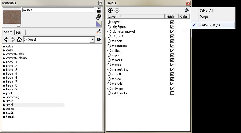
Color by Layer Option
The idea behind this pairing of materials and layers is to be able to temporarily over-ride all real material settings in favor of shades of gray useful an image-editing mask.
I typically manage to generate four different types of useful masks directly from the 3D model:
1. A mask for the model background, the space behind (above? below? to the side?) of the actual model in SketchUp. Inverting this mask permits me to add atmospheric effects, like realistic cloud imagery, or place my model output within some other image context. As a style, in the Edit tab of the Style window, this amounts to Edge Settings none, nothing checked; Face Settings Front color and Back color both set to white, Face Style set to Display in shaded mode; Background Settings background color set to black (RGB 0,0,0); and finally Modeling Settings Color by Layer checked. Here, just download it: Background-mask.style
All layers have their color set to white in the Layers window; any layer that has been paired with a material (as described above) that is transparent should also have its layer color set to some degree of transparency. Finally, in the Shadow Settings window, the Light slider must be all the way to the left (set to zero) and the Dark slider must be set all the way to 100, with Use sun for shading checked: as opposed to producing (as might be logical) a negative image, this shadow setting eliminates all shading in the model. It is not necessary to turn shadows on.
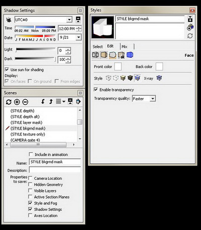
Background Mask Settings
Heres the result of a 2D graphic export from SketchUp as a PNG file (JPG format could introduce artifacts that might make a less precise mask), with these styles, layer colors, and shadow settings applied to the model:
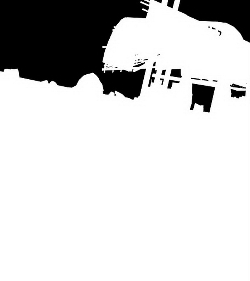
Background Mask
2. Masks that delimit the apparent extent of materialsfor instance, a mask for the cloak, or the rock that needs moss.
Ill apply a style to the model that is similar to the one used for the background mask above: Edge Settings none, nothing checked; Face Settings Front color and Back color both set to white, Face Style set to Display in shaded mode; Background Settings background color set to white (RGB 255,255,255) with the Sky and Ground boxes cleared.; and finally Modeling Settings Color by Layer checked. Heres the style file: Layer-mask.style
As noted above, all of these SketchUp layers that are paired with materials that currently exist in the model have their layer color set to whiteexcept for the layer representing the surfaces with the materials I wish to mask. This layers color is set to black (RGB 0,0,0).

Layer Mask Settings
Once again, in the Shadow Settings window, the Light slider must be all the way to the left (set to 0) and the Dark slider must be set all the way to 100, with Use sun for shading checked to eliminate all shading in the model.
Heres the resulting 2D export, a mask for the rock material I used in the model for the boulders dotting the foreground:

Mask for Rock material
I will probably, for a typical rendering, create a black and white mask for most materials used extensively in the model.
3. Masks for specific objects in the renderingmost of the time, this sort of mask is easy enough to create from material masks (category #2). If I need a mask for the foreground figure, given the current configuration of the Pavilion model, I will do exactly the same thing that I did in #2, above, except that I will change the layer colors for both the layer representing the cloak material and the layer representing the figures flesh to black.
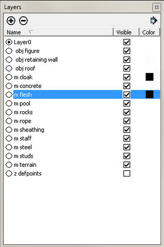
Change Layer Colors
And heres the mask for the figure-object in my model:
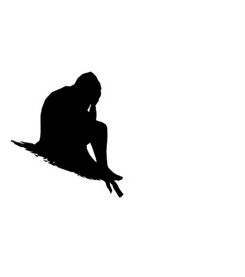
Mask for Figure Object
However, in a model with a greater number of applied materials, where certain objects that I might wish to mask in a rendering share materials with other objects that I do not wish to mask, I might work up some other method, even if temporary, to move all of the geometry for that to-be-masked object to a single layer which I can color black while leaving all other layers in the model white. The goal is simply to have a black-and-white or gray-scale image that will make my task easier when I reach the image editing stage for the rendering.
4. A mask that allows me to limit the effect of any tool or effect based on distance from the apparent point of view. This is what could is sometimes referred to as a depth mask. I use this sort of mask when I want objects in the distance to blur, as if they were beyond the cameras depth of field, compared to objects in the foregroundor vice versa. I also use this when I want to simulate atmospheric perspective: the haze effect caused in the real world by atmospheric particulates like dust or vapor that cause objects to seem dimmer and more bluish-gray the farther away they are from us. Fog or mist, more subtle and believable than the type generated by SketchUps Fog setting, is also easy to create using a depth mask.
There are a couple of ways of creating a depth mask in SketchUp 8.
For instance, I could take advantage of the black fog effect. This involves a style setting almost identical to my layer mask style (#2, above). As above, in the Shadow Settings window the Light slider must be all the way to the left (set to 0) and the Dark slider must be set all the way to 100, with Use sun for shading checked to eliminate all shading in the model. All Layers have their colors set to white. (OR, if the my use of Color by Layers offends your near-religious sensibilities concerning the appropriate layer for faces and you just hate placing actual geometry on any layer other than the default, go back to the Face settings of the Styles window Edit tab, set the faces to Display faces using all the same and set both Front color and Back color to white). Layers representing transparent surfaces should probably be turned off.
And then, in the Fog window, clear the Use background color box and set the fog color (by clicking the color swatch) to black (RGB 0,0,0). Adjust the 0% and 100% positions on the distance slider for fog until objects in the immediate foreground are white and the most distant important objects in your model are gray and barely visible against the black distant fog. Export this as the 2D depth mask.
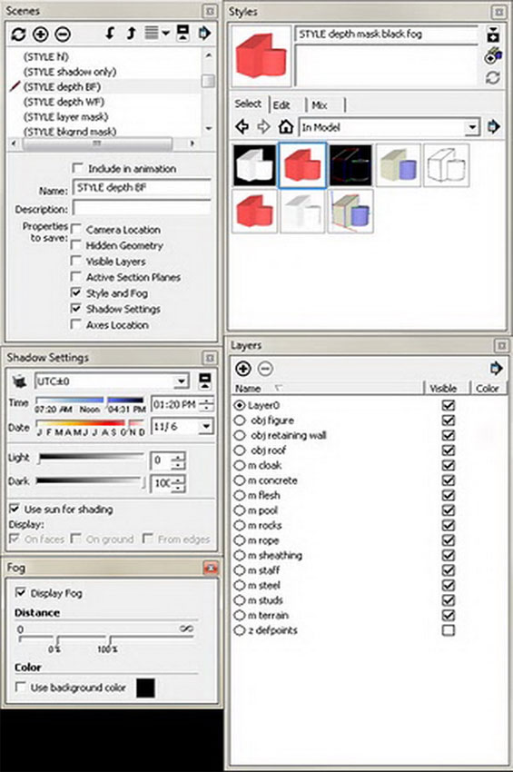
Depth Mask Black Fog settings
Heres the style file: Depth-mask-black-fog.style
And of course the actual resulting mask:
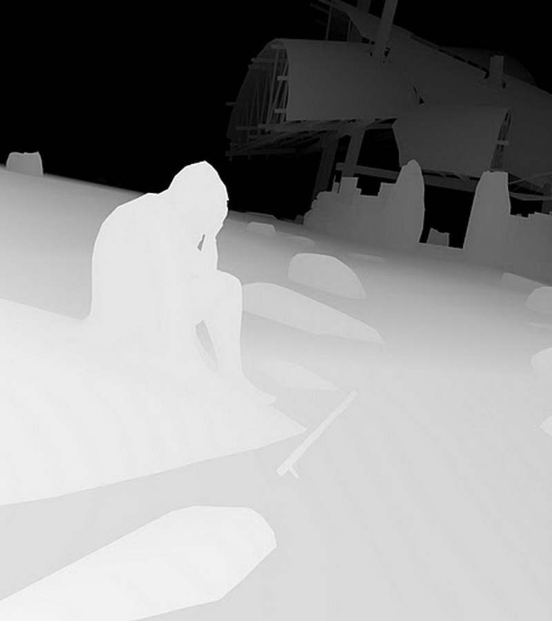
Depth Mask Black Fog
Notice some inconsistency in the depth mask above: the foreground terrain is not as white as the foreground boulder. In practice, when you use a depth mask for some effect in an image editor, these sorts of imperfections dont seem to affect the final result much or at all.
As an alternative to the black fog technique for generating a depth mask, you could make a white fog depth mask, which involves setting up a new style: Edges settings no edges, all turned off; Face settings Display in hidden line mode with transparency enabled or not, depending on whether you have transparent materials in your model; and Background settings set the background color to black (RGB 0,0,0), with the Sky and Ground boxes cleared. No other style settings will actually matter at this point. Any settings in the Shadow Settings window at this point are also irrelevant. In the Fog window, clear the Use background color box and set the fog color to white (RGB 255,255,255) by clicking on the color swatch. Now play with the fog 0% and 100% settings until the nearest objects in your model are black and the very farthest ones of any importance to you are just barely visible gray against the 100% opaque white distant fog. Export a bitmap with this style and fog settings applied to the model: the resulting depth mask will be the negative of what you could get with the black fog setting, but it will function much the same as a mask in an image editor like Photoshop. (Warning: this hidden-line-with-no-edges/white fog scheme for creating a depth mask did not work reliably prior to SketchUp 8 on any PC at which I tested it. SketchUp 7 and earlier did not permit one to choose a hidden line face style with no edges of any kind! It is possible that it may not work on all systems running SketchUp 8. If this scheme does not work, try the original black fog method described above, which has been reliable since a fog plugin first appeared for SketchUp 4.) Heres the style file for this sort of depth mask generation: Depth-mask-white-fog.style
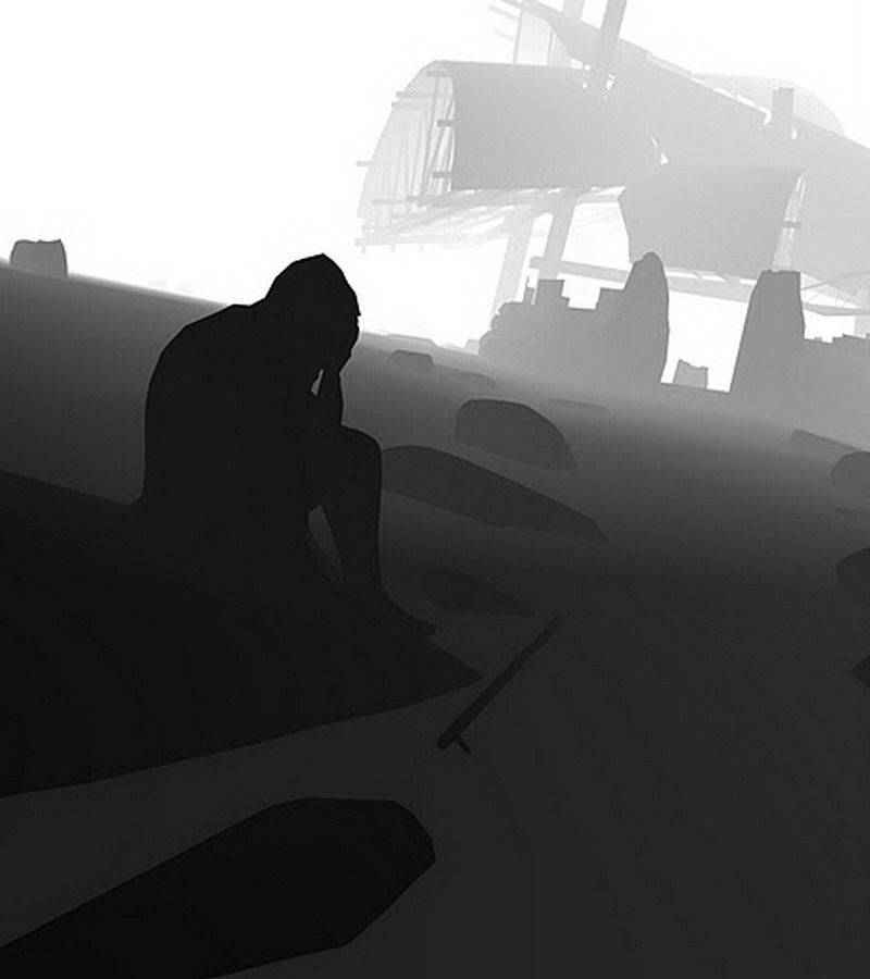
Depth Mask White Fog
Incidentally, when you export a mask image of any sort from SketchUp, be aware of the setting of the Anti-alias check box in the Export Image Options window. If you want your masks to exactlywell, mask certain areas in your non-mask 2D exports, you should not check Anti-alias for any 2D export from the model, mask or non-mask ordinary image export. But I almost always do check the box myself, figuring that any slight misalignment between mask and masked caused by anti-aliasing is a small price to pay for otherwise higher-quality rendering output.
So once, now that I have these mask image exports, how do I convert them into useful masks within an image editor?
(Please note: For the remainder of this article, I will be discussing the use of these 2D mask exports in an image editor, specifically Photoshop. So keep in mind that if I henceforth use the words layer or layers, I am using the terms to refer to layers and associated tools in the image editor, not the layers in in the original SketchUp model. Photoshop layers, then, not SketchUp layers.)
With your main rendering open in Photoshop, open (in another document) one of the black and white or gray-scale mask images you just made. Select everything (CTRL + A, on a PC) and copy it (CTRL + C, on a PC). If you choose, you can now close the mask image. Switch to the main rendering document (the image to which you wish to apply the mask, in other words), open up the Channels window (Window>Channels), and at the very bottom of the window click the small icon to create a new channel, you will see the prompt Create a new channel. The new channel so created will be active and visible in the main Photoshop windowand completely black. Paste the copied mask image into this new channel (CTRL + P, on a PC). Then double click the channel name to change Photoshops default Alpha tag to something useful like rocks mask. If you click the main composite channel at the top of the Channels window (which will be called RGB, or CMYK, or Gray, depending on your image type), Photoshop will make all active channels visible again. If an area is colored red in once you activate the main composite channel, it means you still have your newly-made mask active and visible (red was the traditional color of the masking material used in lithography), so look at the alpha channels (including the one you just made) and make sure the eyeball visibility symbol is cleared from the box to the left of the alpha channel name.
(For the non-Photoshoppers potentially reading this: to save a mask image as a channel in GIMP, you will first have to paste it as the active layer in the document. Then you will have to use the Select by Color Tool to select all the black pixels, or all the white, with a large Threshold setting to get any gray tones. Then you have to choose Select menu > Save to Channel to add the selection to your channel list for future use. In other image editors that do not provide access to channels or that dont permit you to save selections, you may need to leave the mask image in a layer that typically is turned offexcept when you need to restore the selection it represents by turning it on and using whatever tool is the closest equivalent to Color Range or Select by Color to create a temporary mask representing the non-white portions of the mask image.)
To load one of these newly-made alpha channels as a mask or selection in you image, you can do one of two things in Photoshop.
1) Select the channel in the Channels by clicking the visibility box next to the channel name and then clicking the channel name so that it is highlighted. The darker areas of the channel image will appear with a red tint in your open document window. Click the icon at the bottom the of the Channels window that looks like a circle made with a dashed lines (it has a tooltip: Load channel as selection). You will have to make the channel invisible again before you can begin editing your image by clearing the channels visibility box and then activating the main image composite channel (RGB in the example image) at the top of the Channels window. (There is an equivalent functionality for loading a channel as a selection in the Channel dialog in GIMP.)
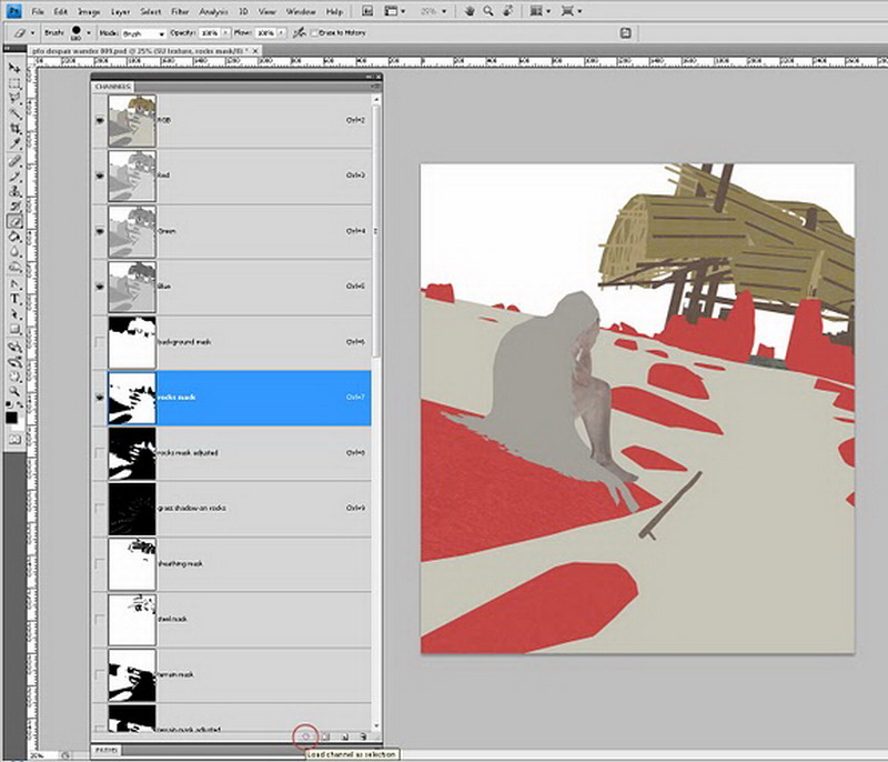
Loading Masks from Channel Window
2) You can go to Selection menu > Load Selection and choose the channel by name in the Source box. Note that there is a check box right below the channel name for inverting the Selection, so that what would normally be selected is now masked and what is normally masked is now selected. You will want to do that very often, depending on what you want to mask with the saved selection. You can also use the various options in the lower box of this Load Selection dialog to add or subtract a channel from an existing active selection, thereby decreasing or increasing the amount of your image that is masked from operations. Because of these various ways of loading a modified or inverted version of a selection/mask, I prefer this method for loading a channel. (Functions for loading a channel as a selection with these sorts of options are available through the Channel dialog in GIMP.)
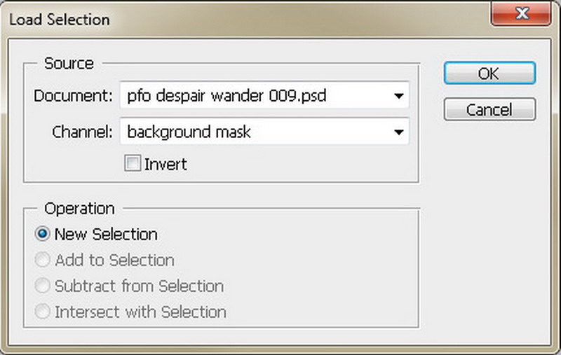
15_load_selection_example
Remember finally that if you load a channel as a selection, and then you realize that the masked area should be the selected area and vice versa, you can choose Select menu > Inverse to switch them. Its worth pointing out here that, although technically a mask is the area of a raster image that is not selected (as much belabored above), for most practical purpose during editing the distinction doesnt matter very much. After I load a selection, I will regularly invert it, so that I can edit the area outside of the previously edited area without affecting my earlier work.
So we have image masks and they are now save as channels in a Photoshop image, ready for loading as a selectionwhat next? That depends on the illustration project. Lets assume that, as an example, I want to give a better apparent texture to the boulders in my example scene. They have a very bland concrete type texture that I applied in SketchUp, but its just not satisfying my desolation-on-the-moors desire.
Ill copy some chunk of a suitably moss-begrimed rock-face image from my collection of such things, and I will paste it into my working Photoshop document (which already contains quite a few layers, consisting of various sorts of 2D imagery exported from the SketchUp model a shadows only layer, a hidden lines no shadows layer, a textured material only no shading layer, etc.), into a new layer, in a new layer group labeled, rocks or stones or something otherwise appropriate.
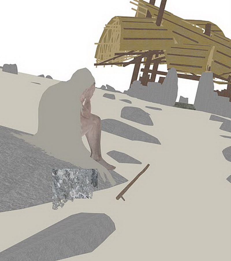
Rock Paint
Yuck! But if I select that pasted rock stuff in the image with any selection tool (or simply hit the CTRL + A keys to select the layer contents), switch to Photoshops Move Tool (M), and hold down the ALT key on my PC keyboard, I can start dragging around copies of the rock textureeach time I let my finger up on the mouse, Photoshop obediently places a copy. I try to position copies of the material all over the rocks and boulders in the underlying image layers. As I place copies over rocks that are farther in the image background, after I place a copy I will use CTRL + T keys to launch the Transform function, and scale the placed copy down to an apparent size more appropriate for the distance from the viewer. Eventually Ill have something like this on the screen:
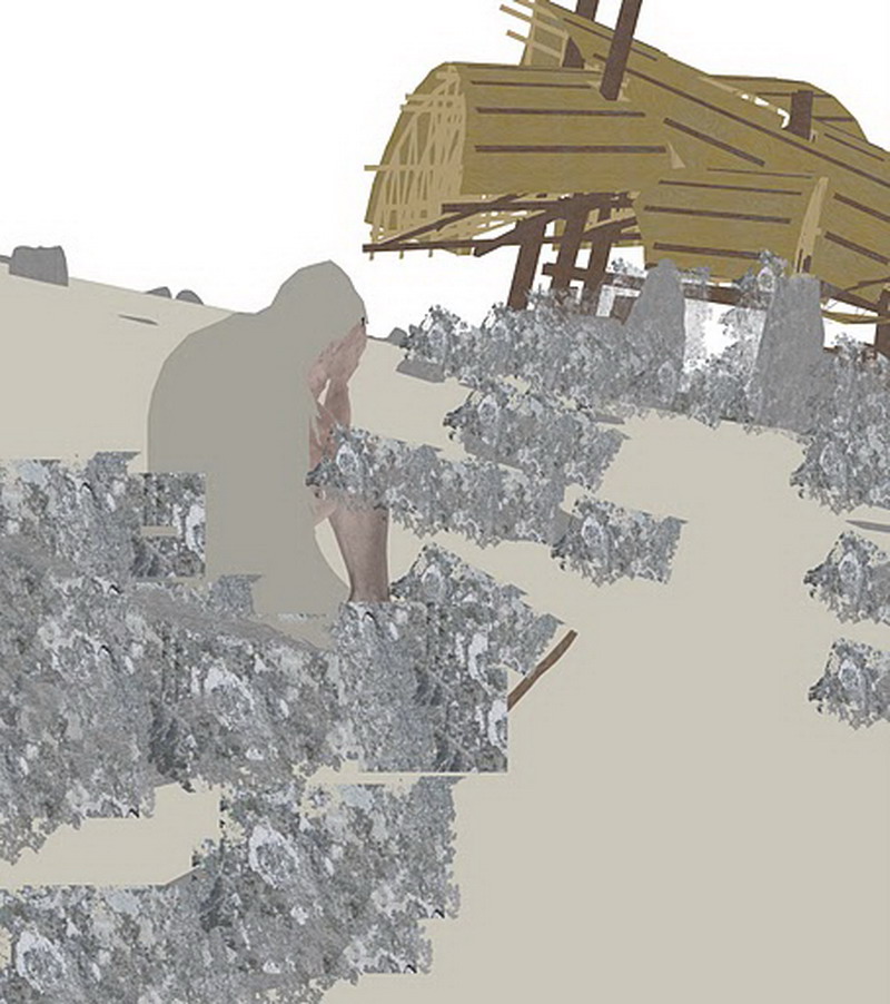
Rock Paint 2
Oh hell, lets repeat this a few more times with bits of some other pictures of interesting rock surfaces.
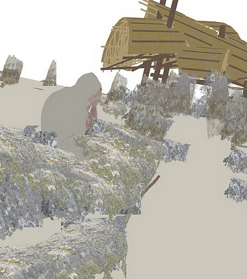
Rock Paint 3
Enough. Ill load the rocks mask I saved as a channel (and foresightedly renamed so I could find it in the list in the Select menu (Select> Load Selection). Note that I checked the box for Invert in the dialog. This is necessary because I am going to have Photoshop convert the selection/mask to a layer mask to hide the parts of my copied-and-pasted-and-copied rock surface bits.

Load Re-Named Rock Masks
In Photoshops Layers window, Ill highlight the layer group containing the stone surface samples (I previously labeled it stones)
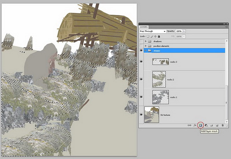
Highlight Stone Surface Samples
Click the Add layer mask button (a dark rectangle containing a light circle) at the bottom of the Layers window.
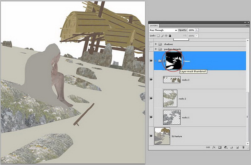
Click Add Layer Mask Button
All those copied samples of rock textures, on three different layers, will only be visible now on the boulders. Notice the layer mask thumbnail now visible in the Layers window next to the folder symbol for the stones layer group. (You knew that you could apply layer masks to layer groups as well as individual layers, right?)
Now I will use the full panoply of Photoshop sampling, filters, and layer tools to mix up, fade, and otherwise blend those rock surface samples so that they convincingly represent the sort of material I want for this scene, for these areas.
And Ill do this, again and again, for all of the areas in my image where the visible surface material needs this sort of robust treatment. Note the grass in the next example image, and the gravel on the path. Notice the Despairing Travelers cloak! These textures were added in much the same way the rock textures were added to the boulders.
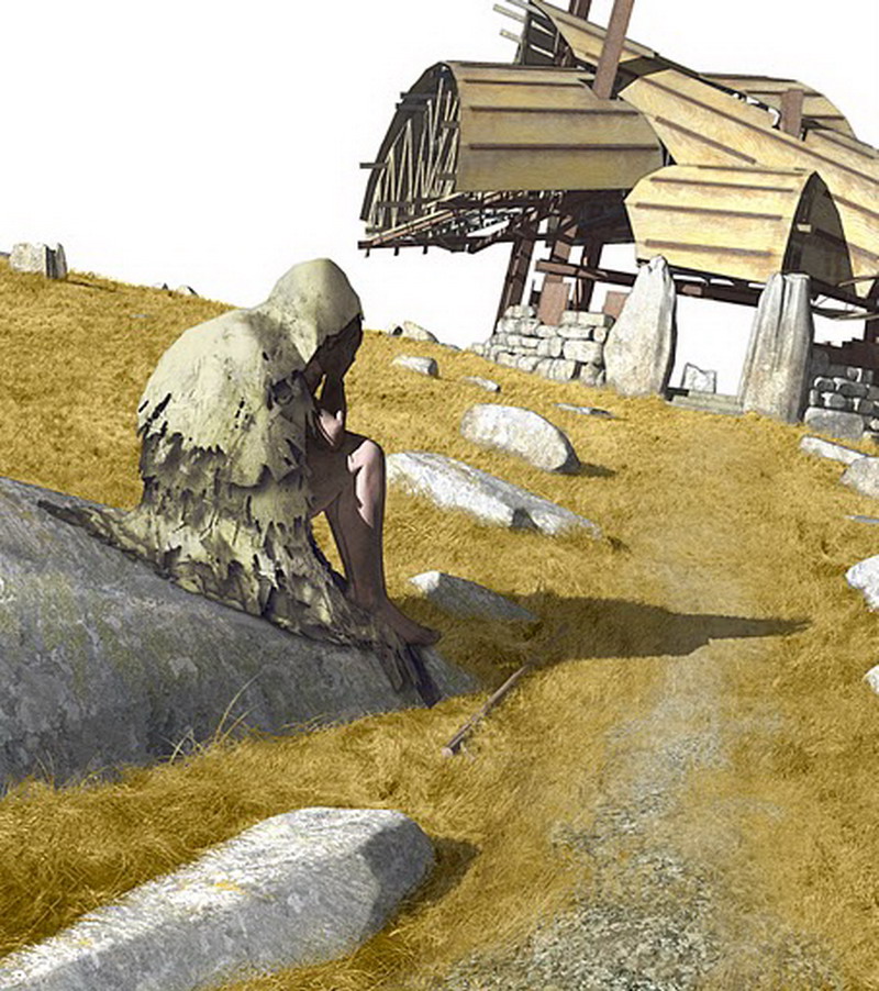
All Textures Added
And incidentally, once all of the various materials have their properly-masked textures limited by layer masks, I may actually go and chip away (paint) the layer masks so that the edges of the masks are not quite so clear-cut. Notice the blades of grass that poke up in front of the rocks, and around the staff on the ground. Compare the original terrain mask (left) with the adjusted terrain mask (right), below.
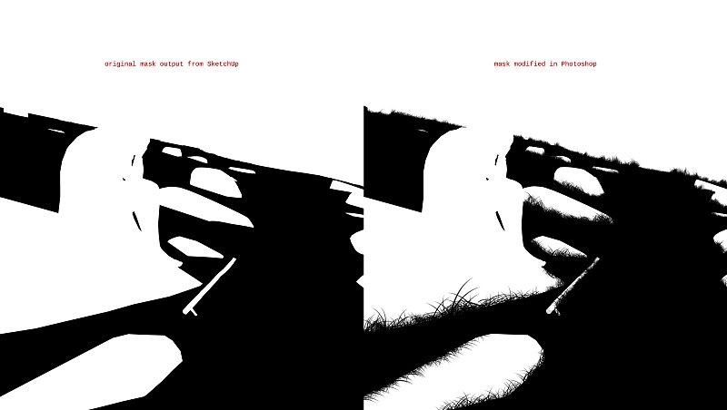
Comparison - Grass Blades Added in Photoshop
I made somewhat similar modifications to the mask for the rocksthere are some Photoshop brushes that convincingly paint grass-blade-like shapes, and they can be used on layer masks and other gray-scale masks as well as full RGB images. Remember: if you use a brush or similar tool on a layer mask, areas that are painted white will reveal more of the layer; areas painted black will reveal less.
What about that sky? I place one of my favorite sky photos (which I took through the window of an aircraft at Logan Airport once) above all the other layers, and load the (inverted) background mask originally output from the SketchUp model and saved as a channel in the Photoshop document.
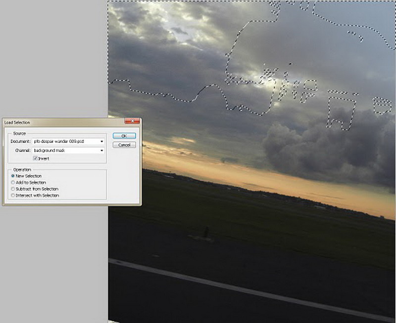
Background Mask Photoshop Settings
And then, with the new layer containing the sky hi-lighted in the Layers window, I once more hit the Add layer mask button at the bottom of the Layers window.
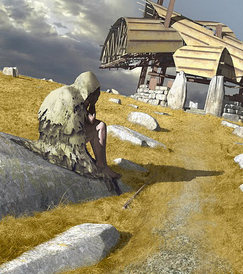
Textures and Sky
Im not quite happy about this, though, even after I tweak and blur the sky a bit. I want some mist, increasing with distance and merging with the firmament, but not really obscuring the pavilion in the top right of the image. Its one of my few published architectural designs, after all, and Ill be damned if I make it difficult to discern. Are there actually meteorological effects that might account for what I have in mind? Who cares? Im basically a recherché Symbolist painter who is just pretending to be an architect, anyway.
So, I make a new layer above the sky layer and fill it with white color. Ill scribble over it with the Eraser Tool (E) set to some low opacity and flow using a particularly grainy Photoshop brush, and Ill decrease the whole layers opacity in the Layer window.
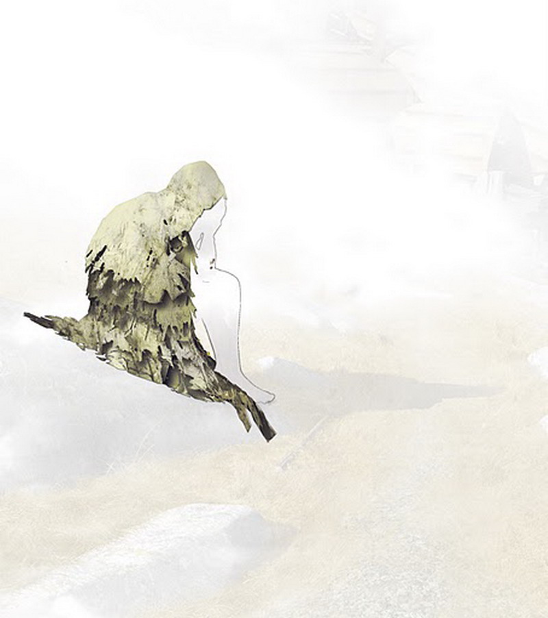
White Fog Effect
(Notice that the texture for the cloak, and some outline for the figure, are not obscured by this cloudy layerthey sit, for no particularly good reason, on the top of the whole Photoshop layer stack.)
Then Ill use Load Selection (Select>Load Selection) to load that depth mask (the white fog version) exported from the SketchUp model and saved as a channel as a selection, which I will convert to a layer mask for the fog layer. You should know this drill by now.
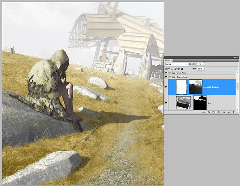
Load White Fog Depth Map
So the fog is more pronounced with distance, but the progress from clear to misty is not as gradual as I would like, and my pavilion is obscuredso I will fuss with this quite a bit. For instance, in Photoshop it is possible to select the layer mask in the Layers window and apply a filter or an adjustment to it, which only affects the mask and not to the associated layer. I use the Levels adjustment (Image > Adjustment > Levels) to change the contrast level of the actual mask, so that there is more gray (representing partially masked areas) and less black (masked areas) in the layer.
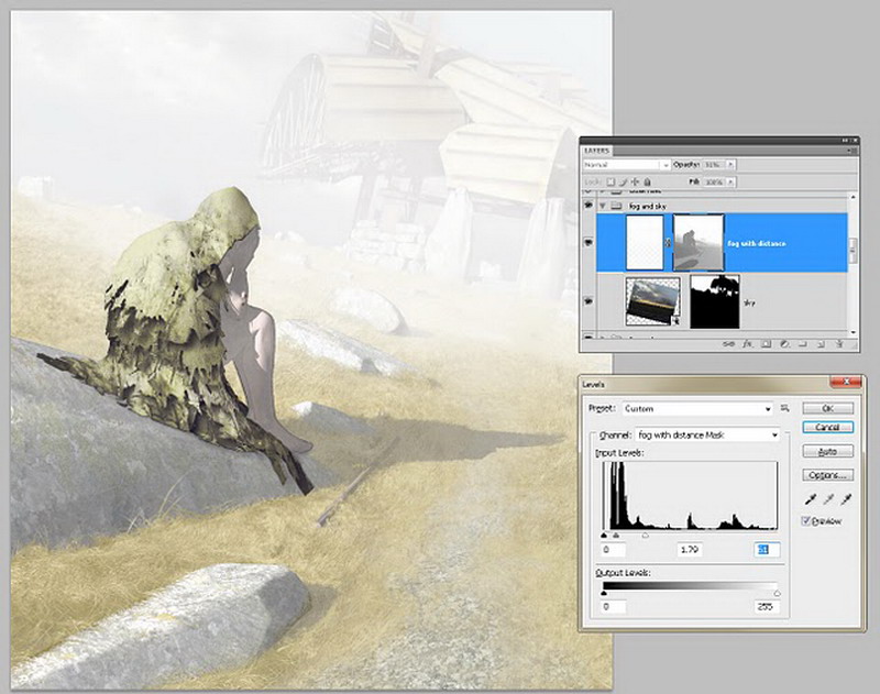
More Fog Adjustments
and so on, until I am satisfied with the location and amount of fogginess in the image. I will ultimately use Photoshops gradient tool to fade the right half of the fog layer mask to pure black, so that the fog doesnt obscure the pavilion in the distance or the path to it. And Ill use an object mask for the figure, extracted from the SketchUp model (see the example above) to paint an area of that fog layer mask black to create another spot in the image that is mist-free. In the final version of this illustration, to achieve the effect I wanted I created a half-dozen fog or mist layers, each carefully masked and adjusted in terms of transparency and layer transfer styles.
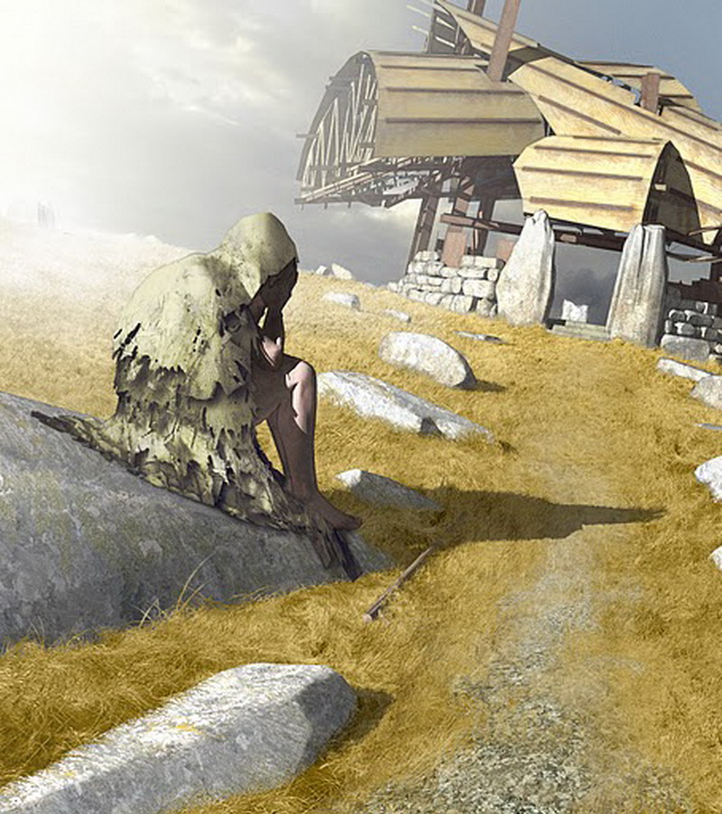
Final Image
Well, thats it. So much for my approach to modeling and rendering: I make my models to make masks. Masks. And more masks.
One last note on this approach: its not for the impatient or the RAM-challenged. With all its layers merged, alpha channels deleted, and saved as a .png file, this 2657 x 3000 pixel illustration (we could call it, Pavilion for Oblivion with Despair, 2011) is a 16.2 megabyte file. But as a Photoshop document the image is comprised of thirty-seven layers with twenty-four alpha channels containing masks of various sorts, for a total file size (uncompressed) of 748.9 megabytes. And that is an increasingly typical working image file size for me.
About the Author:
Lewis Wadsworth, is a designer and artist in Boston, Massachusetts who works principally in the field of architecture. Lewis architectural projects have appeared in AIArchitect, the journal of the American Institute of Architects, and have been honored by the Boston Society of Architects.
He has also illustrated projects for architecture firms in the United States, Australia, and Japan.
Lewis has an undergraduate degree in visual studies from Dartmouth College and a Master of Architecture professional degree from Yale School of Architecture. He currently teaches 3D design and illustration at Boston Architectural College.
You can reach Lewis and see more of his work on his web site:
http://lewiswadsworth.net/
Exporting Masks from SketchUp Models for Use in Photoshop ...
So, now that you know what masking is, as far as a digital image is concerned, you are probably wondering what this has to do with SketchUp. SketchUp 2D exports are
Exporting Masks from SketchUp Models for Use in Photoshop ...
Exporting Masks from SketchUp Models for Use in Photoshop. 15th May 2011 @ 8pm. Its somewhat peculiar to begin a tutorial for SketchUp with a prolonged discussion
Exporting Masks from SketchUp Models for Use in Photoshop ...
ScriptSpot is a diverse online community of artists and developers who come together to find and share scripts that empower their creativity with 3ds Max or SketchUp.
Tutorial: Exporting Masks from SketchUp Models for Use in ...
Exporting Masks from SketchUp Models for Use in Photoshop I will ultimately use Photoshops gradient tool to fade the right half of the fog layer mask to
Exporting Masks From Sketchup Models For Use In Photoshop ...
photos and garden ideas to inspire you Exporting Masks From Sketchup Models For Use In Photoshop. of Exporting Masks From Sketchup Models For Use In
Exporting Masks from SketchUp Models for
Exporting Masks from SketchUp Models http://www.sketchupartists.org/tutorials/sketchup-and-photoshop/exporting-masks-from-sketchup-models-for-use-in-photoshop/
Exporting a 3D SketchUp Model for use in Photoshop
Ever needed to create your own 3D model to use in Photoshop? Forget expensive and difficult to use programs.
SketchUp and Photoshop SketchUp D Rendering Tutorials
Exporting Masks from SketchUp Models for Use in Photoshop by Lewis Wansworth. Its somewhat peculiar to begin a tutorial for SketchUp with a prolonged
Exporting SketchUp groundplanes to use in Photoshop ...
3D SketchUp Community for Design and Engineering Professionals Models. Landscape; Furniture; Extensions; Styles; Books. Intermediate; Beginner; Videos. SketchUp
SketchUp | Tutorials | ScriptSpot
3D Warehouse model you could use for the Exporting Masks from SketchUp Models for Use in Photoshop . Lewis Wadsworth explains in simple terms what masks
ConversionConversion EmoticonEmoticon