Photoshop tutorials are very much in demand nowadays because every web designer wants to know how to create a website with Adobe Photoshop. In this Photoshop tutorial, I will teach you just that.
Note: If you are very new to photoshop or web design you may have some trouble with this tutorial. Here is the end result: 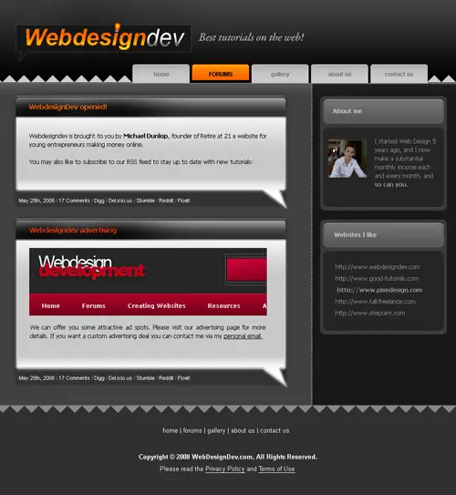 Start by making a new canvas around 950×950 pixels. Fill it with light gray. Select the top with the Rectangular marquee tool and fill it with a darker grey like so:
  On the dark gray layer go to Layer- Layer Style- Gradient Overlay and use a gradient like this:
 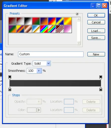 Now select the pencil tool and a 1px brush. Make a line above the light gray layer. To keep it straight you can hold shift.
  Make a new Layer and select the Rectangular Marquee Tool and make a selection like below. Now select the Gradient Tool. If you cant see it right click on the Paint Bucket Tool and it should appear. Select the 2nd gradient option and make sure that the foreground color is white.
 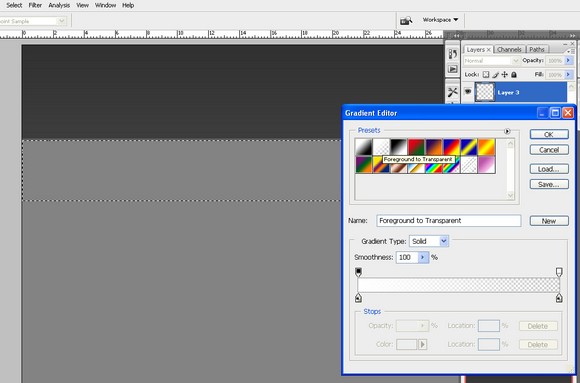 Hit OK then drag your mouse down like below:
 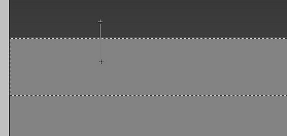 Here we have the result quite nice no?
  I feel the white is abit strong so i lowered the opacity a little bit.
  Make a new layer and select the Pencil Tool again with a 1px brush. Draw a white line like below:
 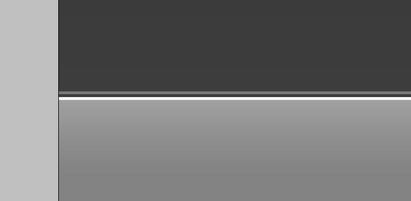 This gives it a cool kinda ingraved effect.
  Off to the navigation! Select the Rounded Marquee Tool with a radius of 5 and make a selection like below:
 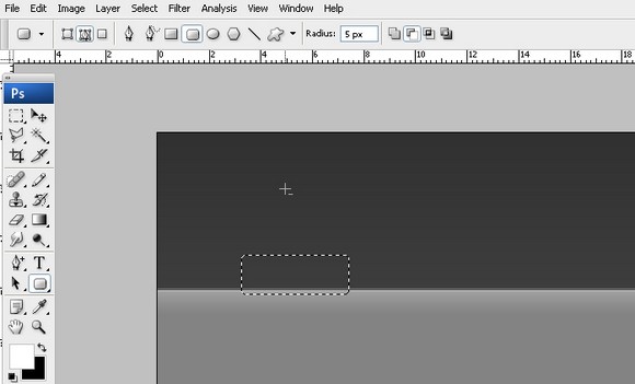 Fill it with white and it should look something like this:
  Cut of the lower part of the button with the Rectangular Marquee Tool. Make the color of the button just a bit darker so it doesnt stand out too much.
  Go to Select- Load Selection then go to Select-Modify-Contract and select 2px. Then Select the Gradient Tool again and now make sure the foreground color is black. Drag down just like before.
 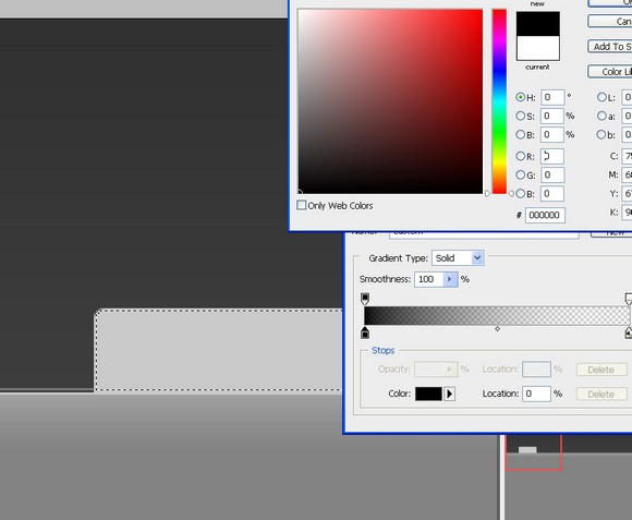 Should look something like this? Getting better right? Lower the opacity of the gradient layer to suit your taste.
  Now make a new group called button.
 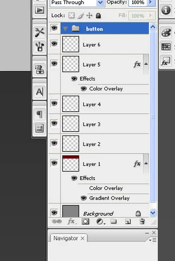 Click on the layers while having ctrl pressed down. Now click and drag them into the button folder.
 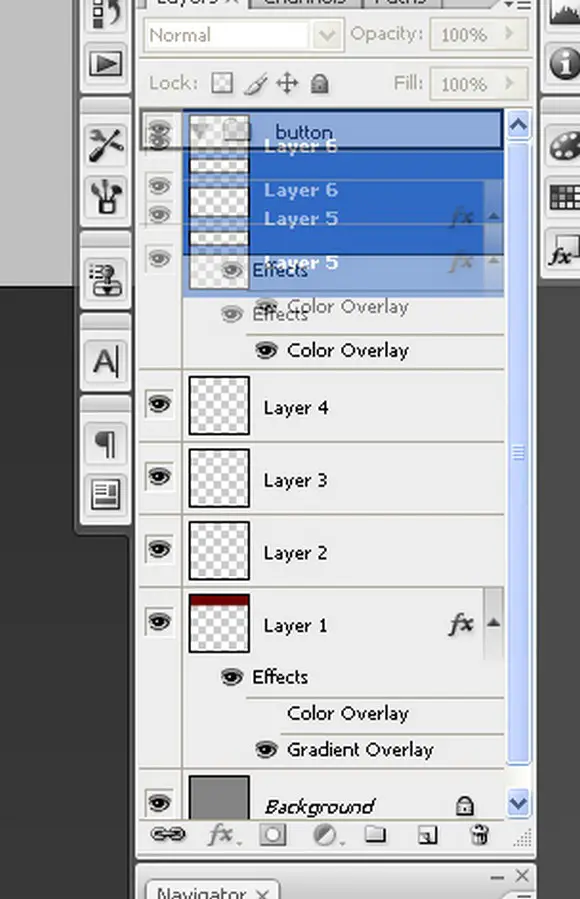 Now go to Layer- Duplicate group and move all the buttons around the way you like. I decided I am going to modify one of the buttons and make it a rollover button. Click the button group you want to edit and select the FIRST layer in that group. Go to Layer-Layer Style-Color Overlay and pick an orange color.
 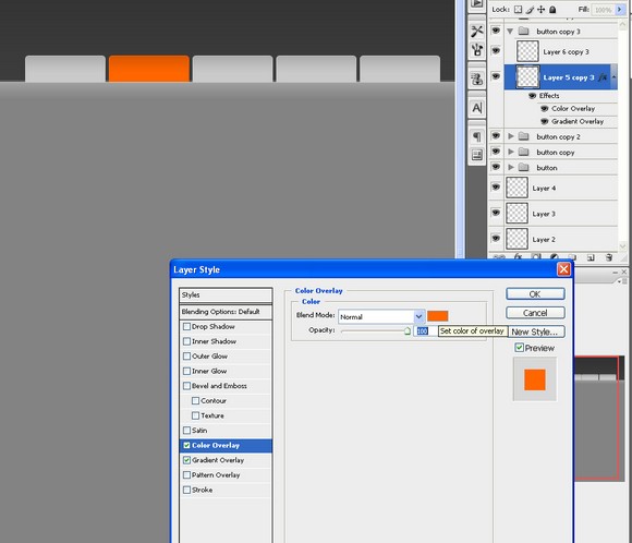 Slap some text in thoose babies and no wayits starting to look like a navigation! Select a dark gray color for the text.
 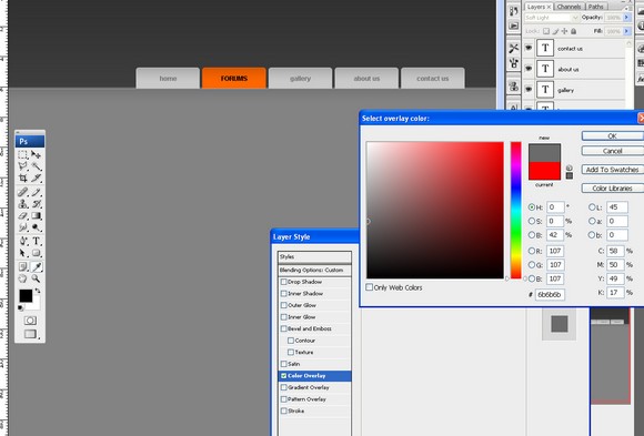 It should look something like this now
 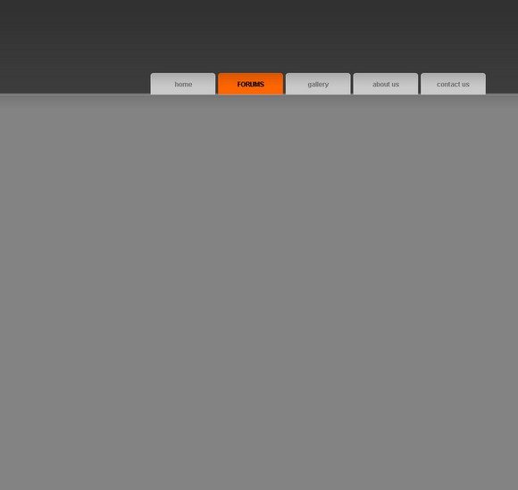 Make a new layer and using the Rectangular Marque Tool make a black shape like below.
 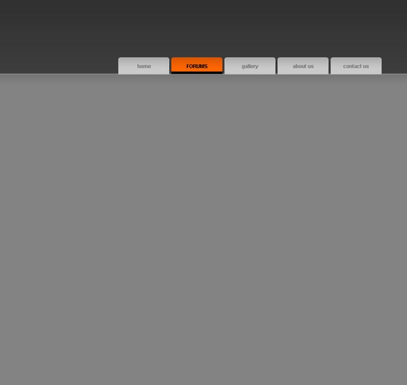 Select the FIRST layer in the rollover button group and go to Select- Load Selection. Using the Gradient Tool set on white to transparent make a gradient. Set the layer Blending Mode to overlay to give it a more orangish color. Ive also just putt in some text.
 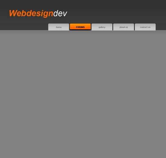 Select the text layer and go to Select- Load selection and move the selection up by about 1-2 pixels.
 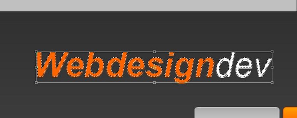 Select the Gradient Tool and on a new layer drag up. Set the layer to overlay. Heres the result:
 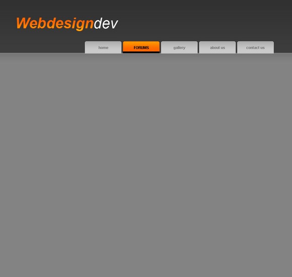 I have duplicated the gradient layer to give it a stronger transition from yellow to orange.
  Select the text layer again and go to Select- Load Selection and move it up by 1-2 pixels. Now select the Gradient Tool, but we wont use from white to transparent now we will use black to transparent.
 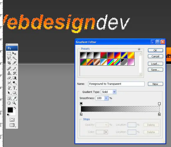 Drag it up on a new layer and it should look like something below:
  Select the Rectangular Marquee Tool and erase the webdesign black gradient part, since we only want the black gradient layer to be on the dev text.
 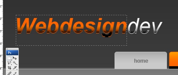 Looks quite good, no?
 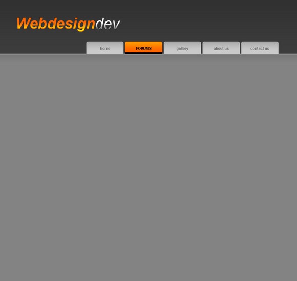 Now just slap in the url font tahoma size 11 and no AA.
 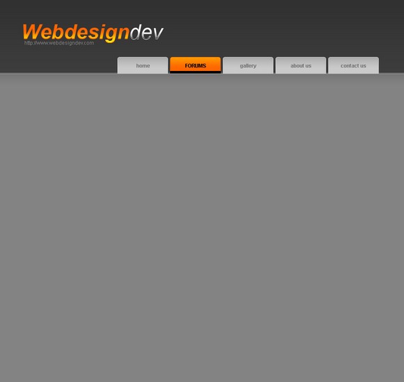 Make a selection with the Polygonal Lasso Tool like so:
 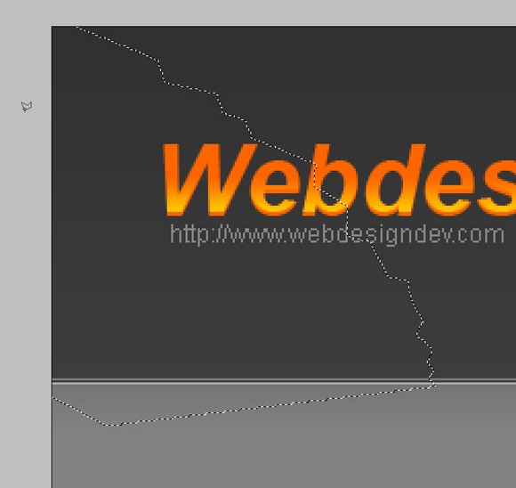 Select the brush tool around 70px it has to be a soft brush! and brush the inside of the selection
 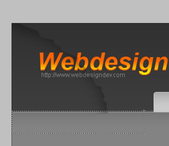 Erase any neccesary bits and it sohuld look like this:
  Duplicate the layer and move it around a bit
  Duplicate it again and move it around
  Erase any bits that stick over the navigation or over the banner part
  Move the 3brushed layers below the text layer so it doesnt cover the text.
  Select the Rounded Marquee Tool with a radius around 3-5px, make a selection and fill it with a dark gray color.
  With the Polygonal Lasso Tool make an arrow shape so the whole part looks like a bubble.
 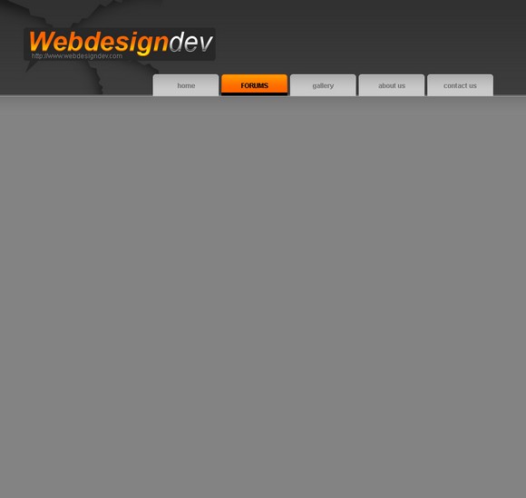 Go to Layer-Layer Style-Stroke and stroke it with a 1px light gray color
 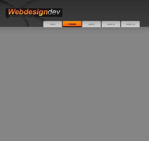 Just some text again, went with a bit more playful font
  Going to start the work on the content now. Select the Rounded Marquee Tool with the same radius as before and make a light gray box.
  Make an arrow like shape again with the Polygonal Lasso Tool.
 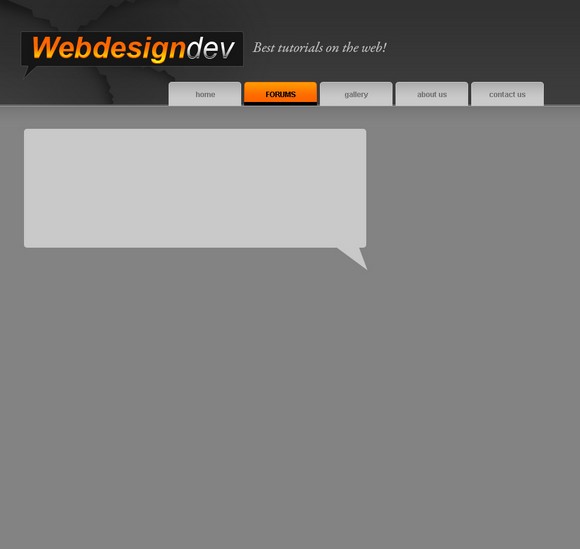 Go to Layer-Layer Style-Stroke and use the settings below:
 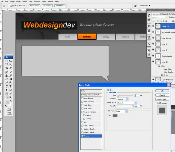 Duplicate the box layer and move it up and fill it with a dark gray color. Should look something like this:
 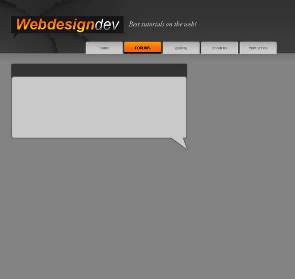 Go to Select-Load Selection and move the selection down by 1px.
  Select the Gradient Tool and make sure youre foreground color is white then drag it down just like before.
 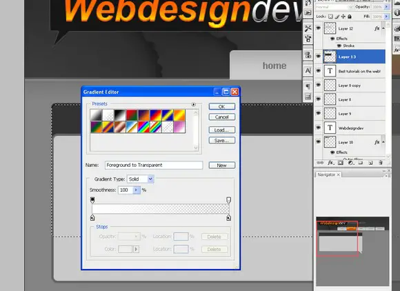 Should look something like thisits slowly getting there, huh?
  I move the gradient layer by 1pixel to the right.
 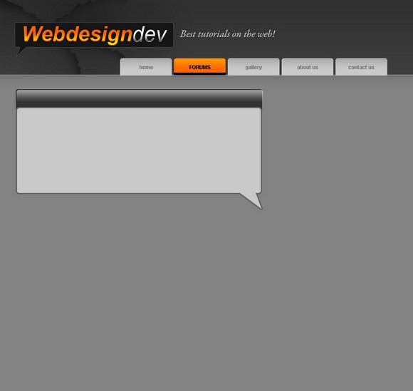 Now cutt it in the middle like so using the Rectangular Marquee Tool
 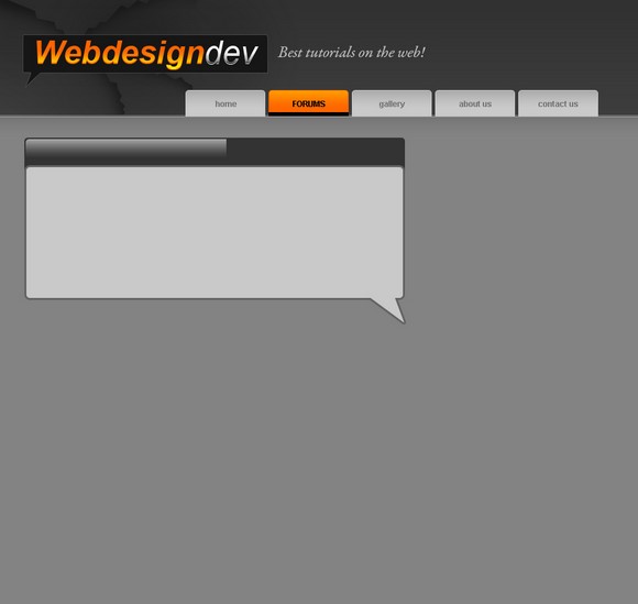 Duplicate it and go to Layer-Transform-Flip Horizontal.
  Now cutt the highlighted part of the gradient using the Rectangular Marquee TOol and now the gradient should be simetrical
  Move the gradient layer and the dark gray layer below so the top of the light gray layer box sticks out on the top by about 2px.Also move these layers above the light gray box.
 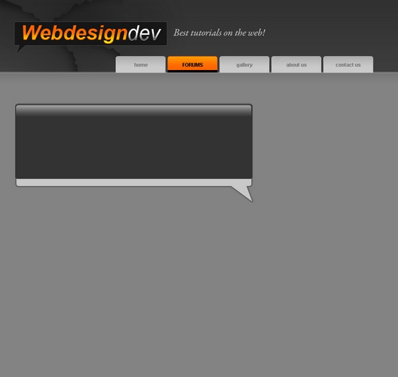 Now using the Rectangular Marquee Tool cut the remaining dark gray layer.
 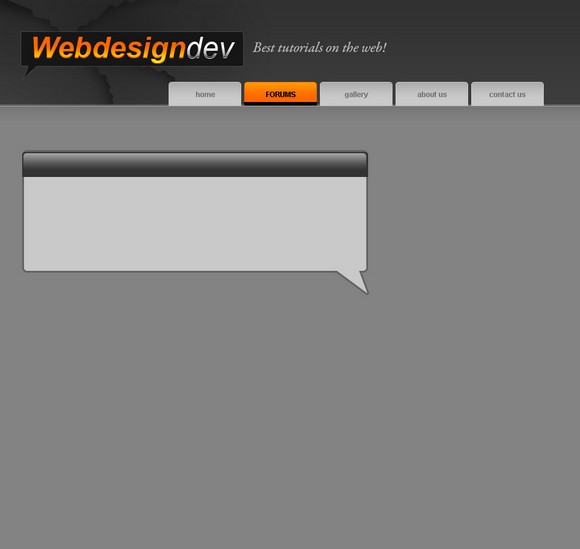 Now select the light gray box and go to Layer-Layer Style-Outer glow and use these settings
 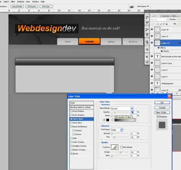 Slap some text in it
  Make a new layer and use the 1px brush with the Pencil Tool and make a line like below
  Decrease the opacity of the layer to whatever you think looks good
  Some more content text nothing special
 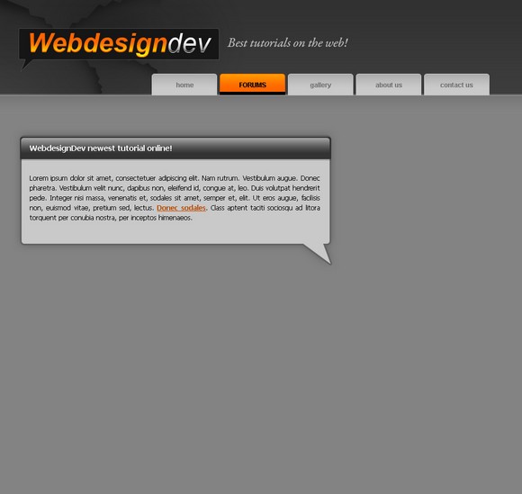 Nove move the whole box area above close to the banner.
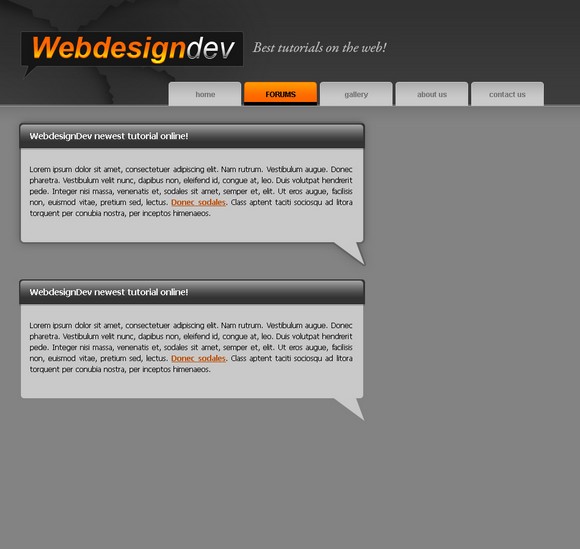
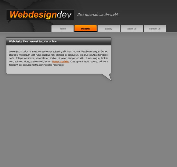 Duplicate the whole box area. I suggest you putt these layers in a Group and then duplicate the group( Layer- Duplicate Group) and move the layers down
 Now on the second layer hide the outerglow effect and the stroke effect on the light gray layer by clicking the eye in the layers box
 Duplicate that layer and move it down to make the whole box bigger.
 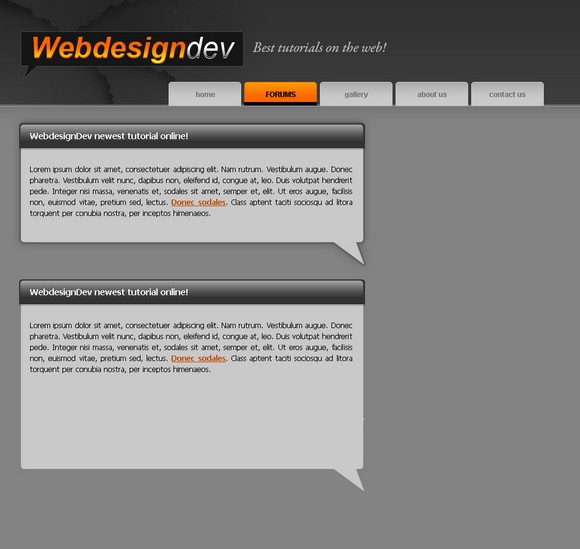 Now merge the 2layers and turn on the outer glow and stroke effect. VOILA our box is bigger
  Some more text to not make it so empty.
 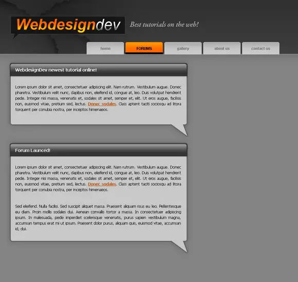 Make a new layer on the right side with the Rectangular Marquee Tool and fill it with dark gray.
  Go to File-New and make a new canvas 30×30 pixels. Were going to make a sweet pattern. Make a shape like below with the Polygonal Lasso Tool. Then go to Edit- Define Pattern
  Now back to out design psd. Make a selection with the Rectangular Marquee TOol and go to Edit-Fill and select Pattern. Find out pattern that we made and hit ok. Decided to remove the brush detail we made in the banner, because it just wasnt working.
 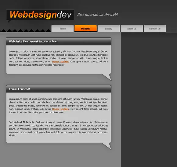 Decided a Light gray color would fit nicer.
  Repeat the same step on the right side of the navigation
  Back to our content boxes. Select the Brush Tool and use a soft brush around 100 pixels with black color. Brush the right side of the bar then cut of the unneccessary parts with the Rectangular Marquee Tool.
 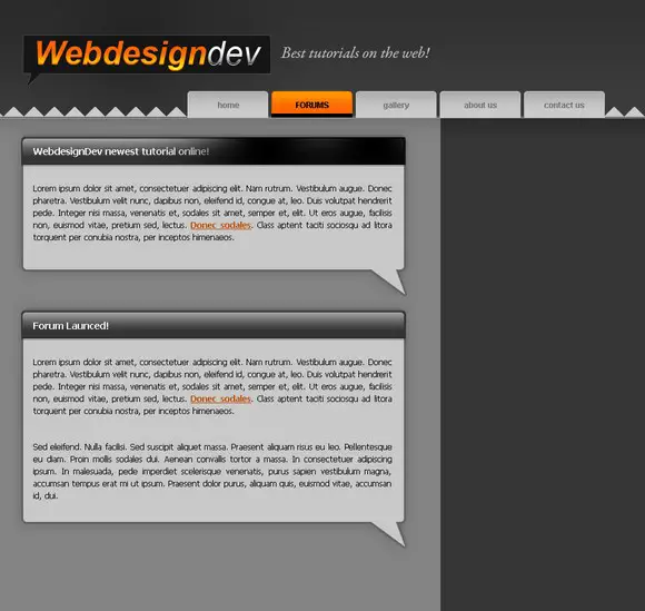 Go to Layer-Transform-Flip horizontal. Make sure this new layer is below the text layer so it doesnt cover it up.Set it to overlay and play with the opacity. Then move it down to the second box so they are identical.
 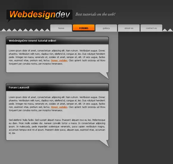 Went for a bit of personal detail with the lamp in the webdesigndev textmade the icon myself a while ago. These kind of things make your design special.
  Ive darkened the whole background to make the content boxes pop.
  Select the light gray layer of the content box and select the Gradient Tool from white to transparent. drag it up from the arrow towards the text.
  Should look just slightly modified.
  Ive duplicated the white gradient we did a couple of times to make the effect stronger. Now make a selection with the Rectangular Marquee Tool like shown below and with the Gradient Tool drag it from your mouse down to the text.
  Your box should look like this
 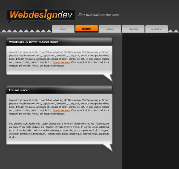 Duplicate all these effects and apply them to the second box
 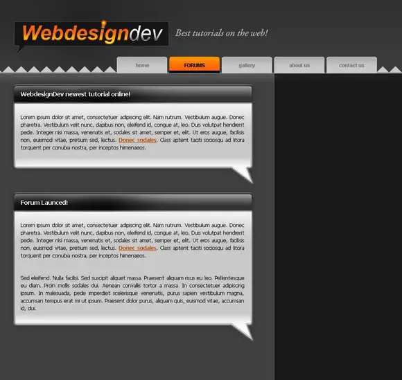 Decided to stick a picture in the second box to make the design abit less dull
 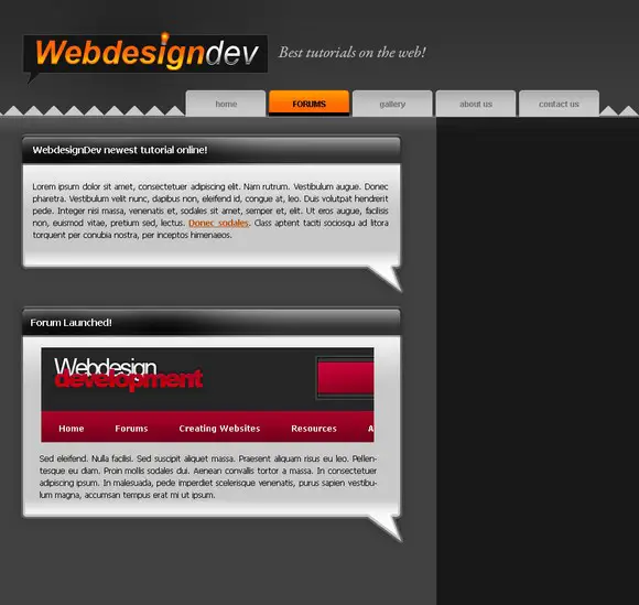 Now we start working on the right columnusing the Rounded Marquee Tool make a shape like below
 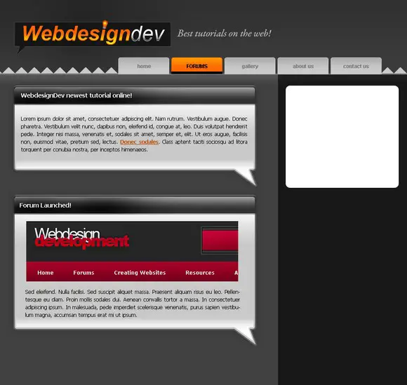 Decrease the opacity to suit your needs.
  Make another shape using the Rounded Marquee Tool and go to Layer-Layer Style-Gradient Overlay and use these settings
 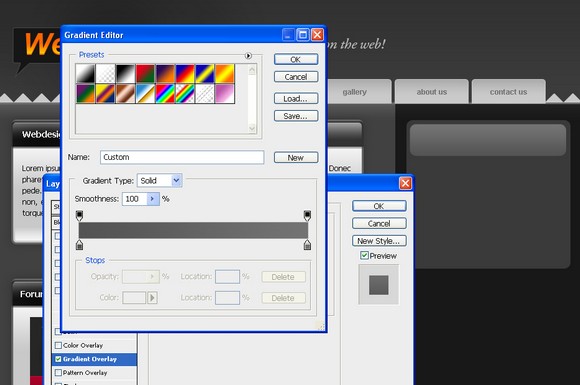 Now go to Stroke and use these settings:
 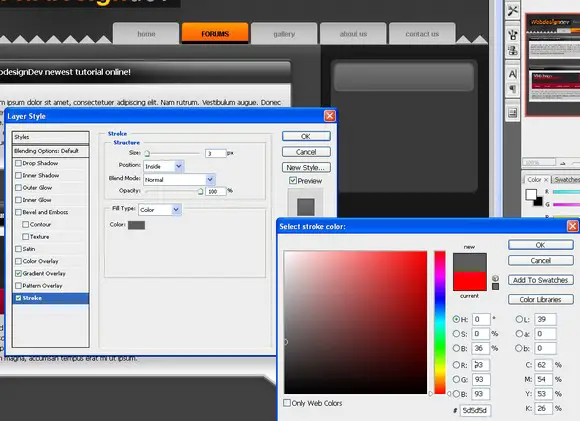 Duplicate the first bar layer and move it 1px up.Go to the first BAR layer and go to Select-Load Selection then select the duplicated layer and hit delete.
 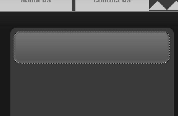 Now move the duplicated layer down abite and go to Layer-Layer Style-Color overlay to make it a light gray color. This makes the box pop out.
  Make another shape with the Rounded Marquee Tool this will be for our text in the right column.
 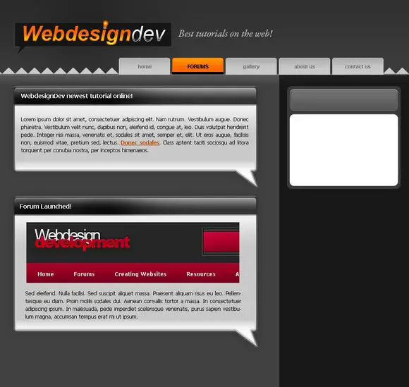 Fill it with a darker gray color so it looks kind of ingraved
  Duplicate the layer and move it 1px down. Now go to the original layer and go to Layer-Layer Style-Color Overlay and use a light gray color so a tiny gray stroke should appear only at the bottom of the box.
 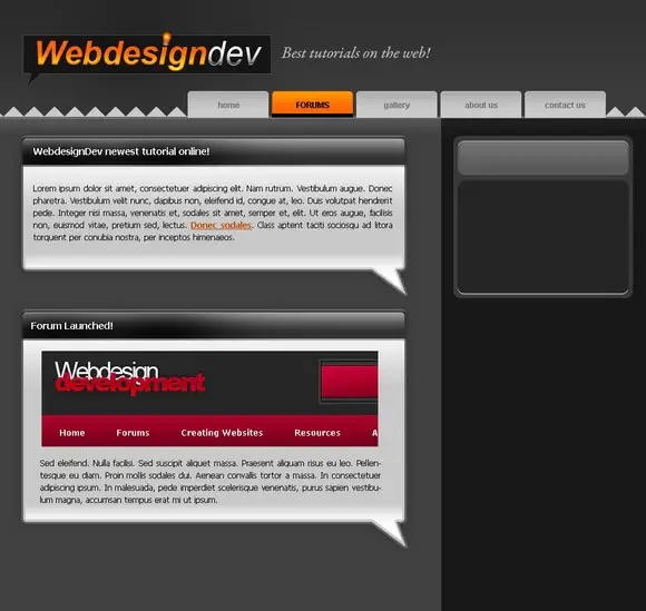 Decrease the opacity abit so it doesnt stand out too much.
  Slap some text in the box
  Duplicate the whole box and move it down.
  Decided to give it abit more and made a doted line on the side of the column. This isnt hard to do just takes alot of time.
 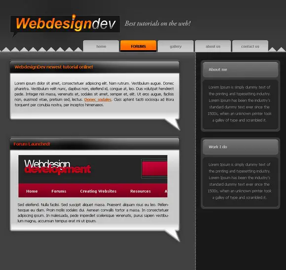 Go to the first banner layer and go to Layer- Layer Style-Gradient Overlay and use these settings:
 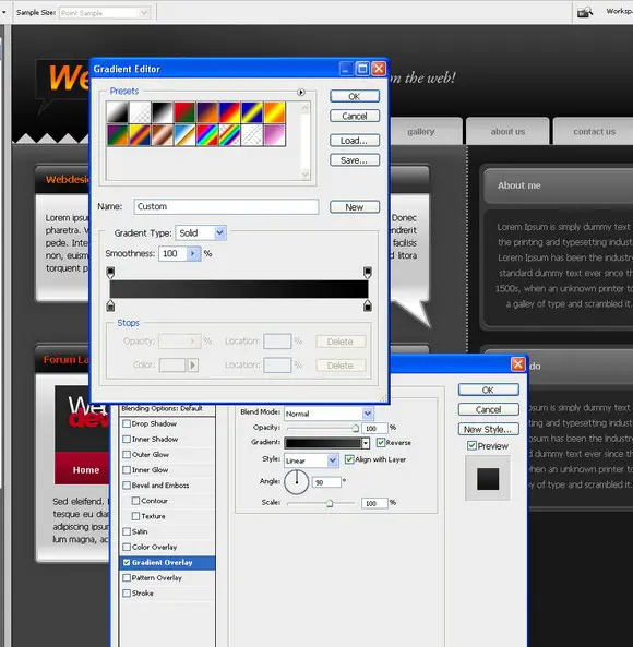 Wow its starting to look like a good design now!
 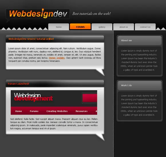 Starting on the footer area. Made a selection with the Rounded Marquee Tool and filled it with our pattern. Then go to Edit-Transform-Flip vertical.
 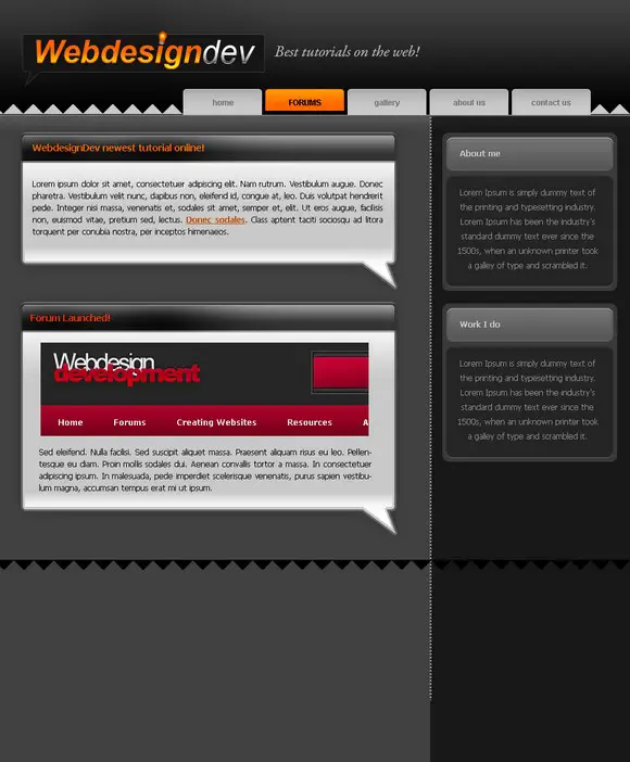 A light gray color to match the banner pattern color.
  Now just below the pattern layer make a new layer and fill it with the same color the main content is filled with.
 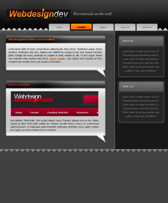 Starting to putt some text in it. Copyright is very important because you never know when your work might get stolen.
  Some personal touches to the content area. Using the Rounded Marquee Tool. Nothing we didnt learn by now.
 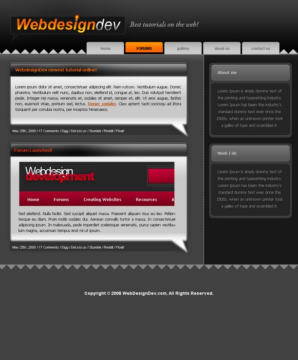 Filled it with some actual content about webdesign dev and Michael Dunlop.
 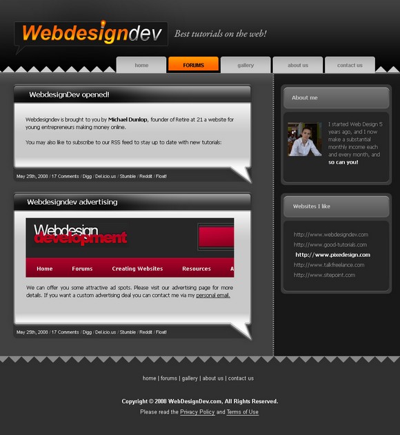 And here it is. If you managed to finish this tutorial Im sure you can become a great webdesigner. By the way, if you feel frustrated with designing, or just want an easy way out, you can always create a free website with Wix. Remember every photoshop tool even the most basic ones can be great when used right.
About the Author
Photoshop Tutorials
Photoshop tutorials for beginners to experts. Learn tips and tricks on how to use Photoshop for photo editing, manipulations, designs, and more. Photoshop Tutorials.
Photoshop Tutorials, How To Edit Pictures | Photoshop.com
Learning search results Adobe Photoshop software tips, tricks, and inspirations that bring out your brilliance.
Photoshop Tutorials from lynda.com - Online video ...
Photoshop tutorials walk through fundamentals, Our expert instructors can help you learn how to use Adobe Photoshop to improve your photos and create digital artwork.
Photoshop Tutorials - How to Create a Website With Adobe ...
Photoshop tutorials are very much in demand nowadays because every web designer wants to know how to create a website with Adobe Photoshop. In this Photoshop tutorial
Tutorials - EntheosWeb
In this Photoshop tutorial, you will learn how to create a Polaroid Photo Collage with Adobe Photoshop CS6.
How To Get Started with Photoshop CS6 - 10 Things ...
Photoshop offers a ton of capabilities, How To Use Adobe Photoshop Touch for iPhone and An 00:13:16 : Creative Cloud for Photographers
How To Make A Website In Adobe Photoshop - designrfix.com
I have rounded up an amazing collection of high quality tutorials on how to make websites in Adobe Photoshop. this compilation of web design tutorials is a must
Pegaweb Web Design & Photoshop Tutorials
a site featuring Adobe Photoshop tutorials that specifically show you This tutorial shows you how to use Adobe Photoshop to make a website layout that
Adobe Photoshop CC - How to create and generate web ...
you start in Photoshop CC, create image assets, With Adobe Generator, Photoshop automatically creates separate, For customization tutorials,
How to Create a Professional Web Layout in Photoshop ...
Create a Professional Web Layout Photoshop Tutorial Resources. Subscribe to our mailing list and get the latest Photoshop tutorials, tips,
Travelling is my life
ConversionConversion EmoticonEmoticon