Creating posters with Photoshop can be a lot of fun and there are unlimited opportunities. Anyone who knows me knows that I love movies. I recently was overcome with inspiration when I saw the new James Camerons Avatar Movie Posters, they are pretty sick. In this tutorial I will show you guys some simple but efficient techniques that will help you make your own Avatar movie poster from a portrait picture of yourself. This tutorial should be used with many variants and additional techniques unique to the artist.
Note: The version of Photoshop that Ive use is CS4. You can buy it from Adobe.com (buy it, not download it for free).You can also download a 30 day trial from here.
Ive got a lot of emails from people who wanted me to Avatarize their pictures. I can do it for you for a small donation, just send me a message at: icanbecreative @ gmail.com
![]()
The first step is to show you from what pictures i get my inspiration:
![]()
![]()
![]()
Step two is preparation. First, make sure that the picture youre working with is as large, clear and high quality as possible, the quality of the original picture will determine the quality of the final product.
Download the photo that well be using for this tutorial: Download link
![]()
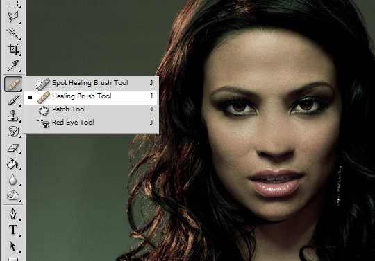
Open the picture, duplicate the background picture layer (now you should have two copies of the same image in your layers menu) and use the Healing Brush Tool (select the source from the forehead area, or something similar) to recreate the nose which is flatter and broader as compared to the average human nose.
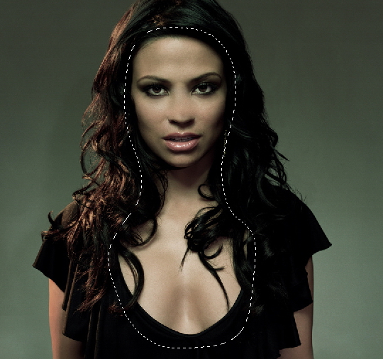
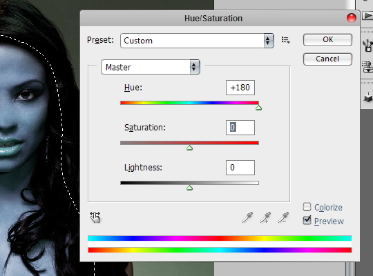
Select the skin areas of the model with the Lasso Tool, like in the picture below, and pres CTRL+U to open the Hue/Saturation menu.
Now we are going to make the shadows for the nose. Select with the Lasoo tool the areas like in the picture below, pres CTRL+C and CTRL+V (to copy/paste to a new layer) and set the Blend Mode to the new layer to Multiply. Go to Filter > Blur > Gaussian Blur and set it to 2.9
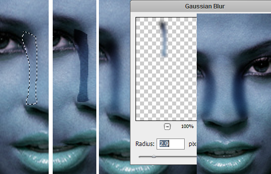
Repeat the process 2 times for the other side.
Duplicate the layer from the step 04 and put in on top the nose shadows layers. Select the lips and the nose with Lasso Tool and pres Ctrl+U to open the Hue/Saturation menu again. Hue to +99 until you get a pink color.
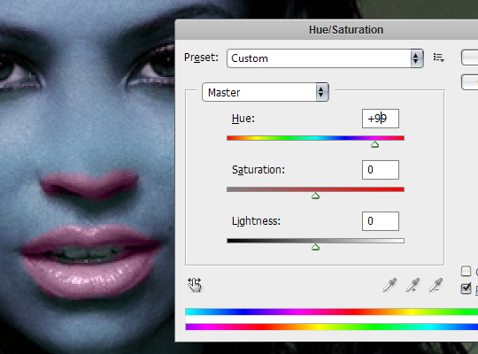
Set the Opacity to 54% until you get the lips and the nose to a purple color, and the shadows of the nose to be less visible. Take the picture below for example:
Make all the layers Flatten if you are sure if you are satisfied with the result so far.
Here comes the most difficult part, the nose and the eyes. I used Liquify in the Filter menu, and simply moulded the nose and the eyes into that of a Navis face, while checking back and forth on actual screenshots.
For the nose use the Forward Warp Tool to make it more flatter (from the Liquify options) and for the eyes use the Bloar Tool to make them more bigger .
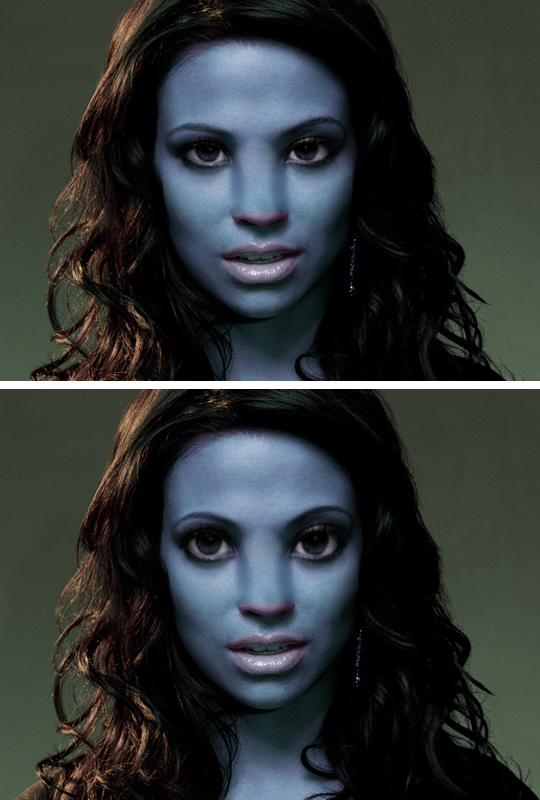
Extra styling: The lips of the model are very big, try to make the smaller with the Forward Warp Tool.
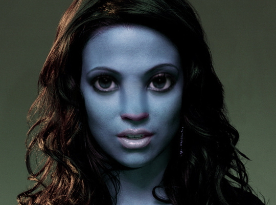
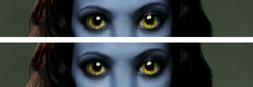
Navi irises are considerably larger than human irises in relation to the size of the whole eye.
Make a new copy of the last layer and with the Eraser Tool make some holes like in the image below:

Make a new layer and put it underneath the current layer, here we will put the eyes.
The eyes i used are from the picture below:
Or you can use the eyes from the official Avatar posters (change the Hue/Saturation to have a yellow color more intense):
Use the Polygonal lasso tool to select the eyes, copy and paste them below the layer where you did the holes.
Enlarge the eyes until you feel the size is good (one eye at a time). Use Eraser to remove imperfections. Adjust the shape of the eye with Liquify.
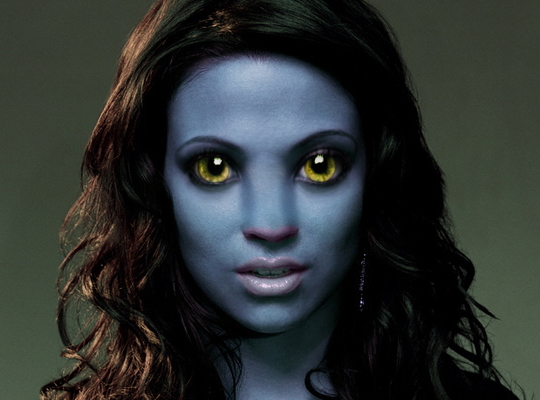
For some extra styling we will add some eyelashes, download the brushes from here, and aply them like follow (use your imagination to adjust them until you feel the size is good):
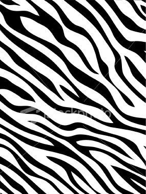
Lets put some stripes on our model. Download the zebra stripes patterns from below (right click > save as):
Add one of those patterns as a new layer. Go to Filter > Liquify and using all the tools make something similar like what i did:
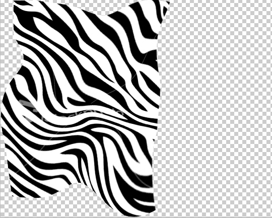
Erase the right side:
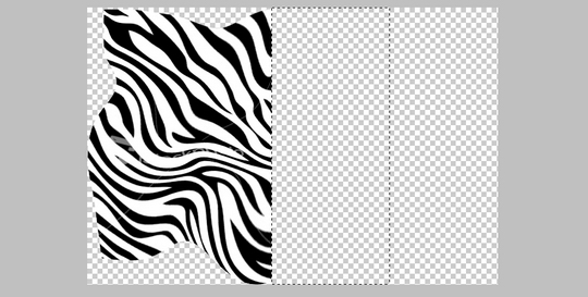
Duplicate this layer and go to Edit menu > Transform > Flip Horizontal and join them like in picture example below:
Make them as one layer. Set the Opacity to 18%. Move the stripes to the models face:
Use the Eraser tool to leave only the stripes from the face area. Set the Blend Mode to Soft Light. Repeat the process for other skin areas.
To add the bioluminescence dots make a new layer and use a small brush, make may dots of different sizes. Theyre generally pretty heavy on the nose, brow, under the eyes, at the corner of the mouth and running down the neck.
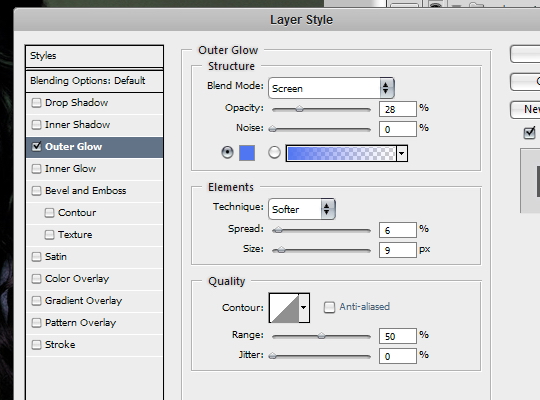
Go to Layer > Layer Style > Blending Options > Outer Glow and set it like this:
Group the layers to a folder (while the dots layers are selected pres Ctrl+G). Set the Blend Mode of the folder to Pass Through.
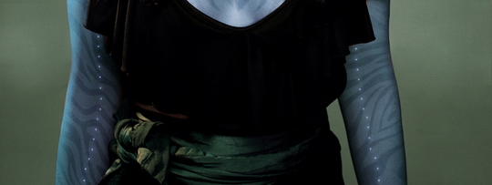
Extra styling: Add some dots on the arms.
I found a good quality still of a Navi ear and imported in into my file, then isolated the ear using Lasso Tool, then re-sized it and placed it where I wanted it to be.
To make the ear more real, go to Filter Men > Filter Gallery, the go to the Artistic effects and select Plastic Wrap.
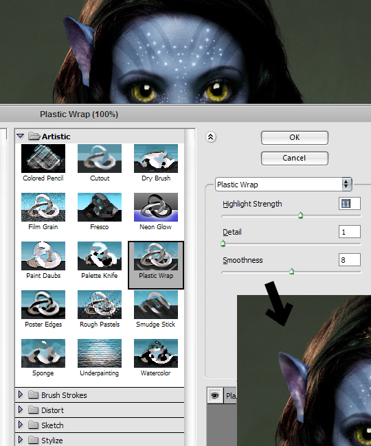
Mask the ears with some hair, use the Dodge Tool to brighten the left ear and the Burn Tool to darken the right ear.
This part is the most request from all the tutorial. Lets add some Leather Texture to our model. Ive prepared for you a large, clean and high resolution leather pattern.
![]()
Lay the leather texture image on top of the face (an other skin areas), and repeat it over as many times as it takes to cover the face. Dont stretch it, just duplicate it. Once you have done this, merge all the layers together (by holding shift and selecting every layer that has the leather texture and goinf Right Click > Merge Layers). Once they are one single layer make sure you erase the eyes and lips with the Eraser tool and change the layer style to Overlay and the Opacity to 15-25% (adjust until you feel the opacity is good). Try to put this layer under light dots layer.
From now it is just adjusting minor details to your image, and adding your own little touches here and there.
![]()
The font used for the movie is very similiar to Papyrus (windows default). Lets re-create the title effect:
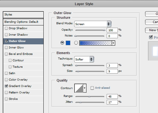
Ok, after that apply Outer Glow and Gradient Overlay layer styles to this layer:
This part is only for extra-styling. We are going to play around with the coloring now so go to Image > Adjustments > Color Balance. Select the Midtones radio button and in the three Color Levels boxes, enter these values: +46 +11 +13. Now select the Highlights radio button and enter these values: +26 +16 -10. Again, you can play around with these settings if you want a different look.
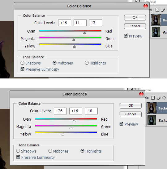
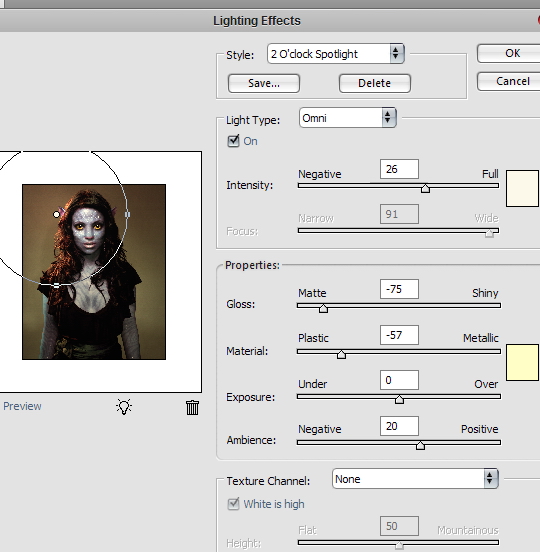
Now we are going to add some lighting to this layer, so go to Filter > Render > Lighting Effects and select the options like in the image below. Play about with the angling settings until you get something that you like.
![]()
Finally, we are done with our avatar movie character and poster creation in Photosop. I hope this tutorial helps lead you in the righ direction! Please post you Navi Avatar picture that you made from following this tutorial, i would love to see them! And please, if you have any question, feel free to ask, I am here to help!
ConversionConversion EmoticonEmoticon